


#026: The Birch
Showing off modern real estate using modern design architecture.
We’re back with a new edition of Web Wizards! Today’s edition is the perfect mix of elegance and freshness. After all, what better way to showcase the beauty of a modern apartment complex than by using smooth animations, serif typography and muted colors?
Got a cool website you’d like to see featured? Let me know by replying to this email or reaching out.

An Intro
Dexter Washington (he/him) is a UI Designer & Founder of Crafted Studios & Crafted Essentials, Crafted Studios is for larger teams and companies with larger project needs and Essentials is for small businesses and pre-seed companies. He also coaches freelancers who are looking to build out their studios. He lives in California and outside of work he spends time enjoying photography, plants, and motorsports.
About the Site
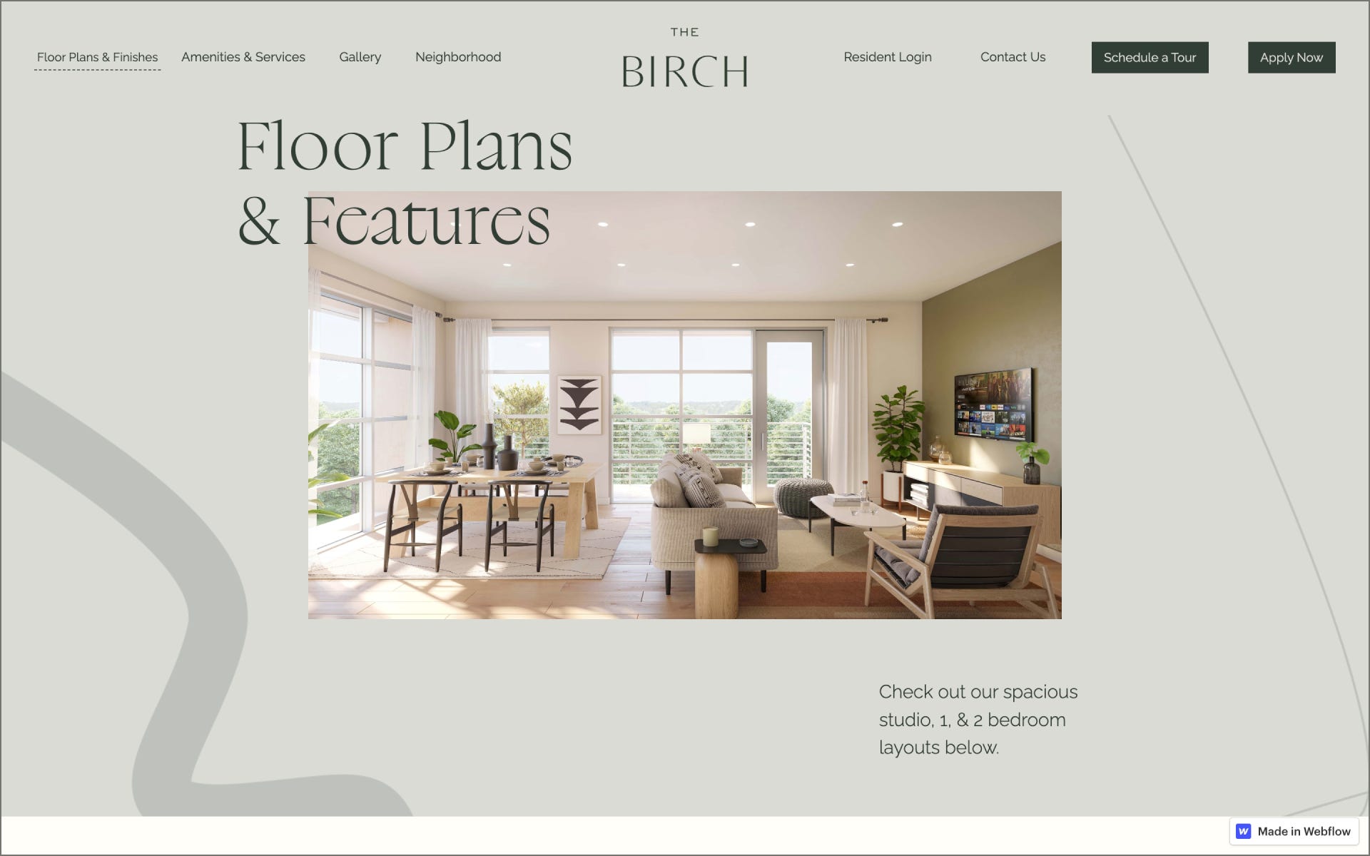
This project which was designed by myself and collaboratively with Katherine Chao directing the feel for the client offers a look inside of an apartment complex that is focused on community building. There’s plenty of amenities, beautiful scenery surrounding the neighborhoods nearby, and interior design that the client wanted to showcase and we’ve successfully nailed it.
Collaborator(s): Crafted Studios & Katherine Chao / Creative Director
Tools: Webflow with some custom CSS/Javascript work

Q&A
What did your concept ideation process look like for this project?
We’ve been working on this for a while, so the first iteration was a landing page from Cohere (our partners) that we helped transform into more. The concept was to bring out elegance, landscape, and history of the city of Conshohocken.
How did you strike a balance between creativity and functionality in this website design or build?
We let the typography and brand aesthetic do most of the heavy lifting while we let subtle micro animations in development using Webflow do the rest. Functionality wise, we kept the build pretty simple and focused on the main goal. Which was the CTA to get them to book a tour of this beautiful space they’ve built.


What challenges did you have whilst designing/building this site?
Yea the challenge of this site mainly was developing the text overlaying the images and nailing the proportion height of sections together so nothing gets too wonky while scaling down to mobile. There’s a good amount of custom relative positioning across the site, so it took A LOT of fine tuning.
What are some of your favourite elements/features on the site?
The typeface, so much so that I recently used it in our new Crafted Studios website. It has a ton of elegance to it.


What’s one new thing you learned during the entire process?
This project opened my palette in terms of layouts in design and to take more risks color palette wise.
If this website was a lead single, what song would it be and why?
Haha good question. If this website was a lead single it would probably be “Pesos” by Lance Skiiwalker & Sir. This project is a time marker for me, the song talks about spending time in solitude, introspection, and focusing on making money/music. This project marks a time when I was just getting started building out my studio, in solitude. If we’re talking about the design itself, the song has dreamy tones, reverberation, and has lots of short “to the point” lyrics. The project is short and visually captures elegance.

Thanks for reading! Definitely reach out if you’d like to be featured or would like to recommend a site to feature.