


#020: Richard Ekwonye's Portfolio
A successful collaboration between a designer and developer, resulting in an amazing portfolio site that is both technically and creatively sound.
We’re back with a new edition of Web Wizards! We’ve seen some amazing portfolio sites in previous editions, and this one is no different. A classy yet professional style that exudes originality, sophistication and a flair for subtelty. That’s the fancy way of seeing this is an amazing portfolio site that shows off creative work in a cool way.
Got a cool website you’d like to see featured? Let me know by replying to this email or reaching out.

An Intro
My name is Gil Huybrecht, designer and skateboarder living in Belgium. I primarily focus on web design and more specifically in the brand experience side of things. The main services I provide are art direction, web design and interaction design.
➤ Socials: Instagram, Dribbble, Newsletter
About the Site
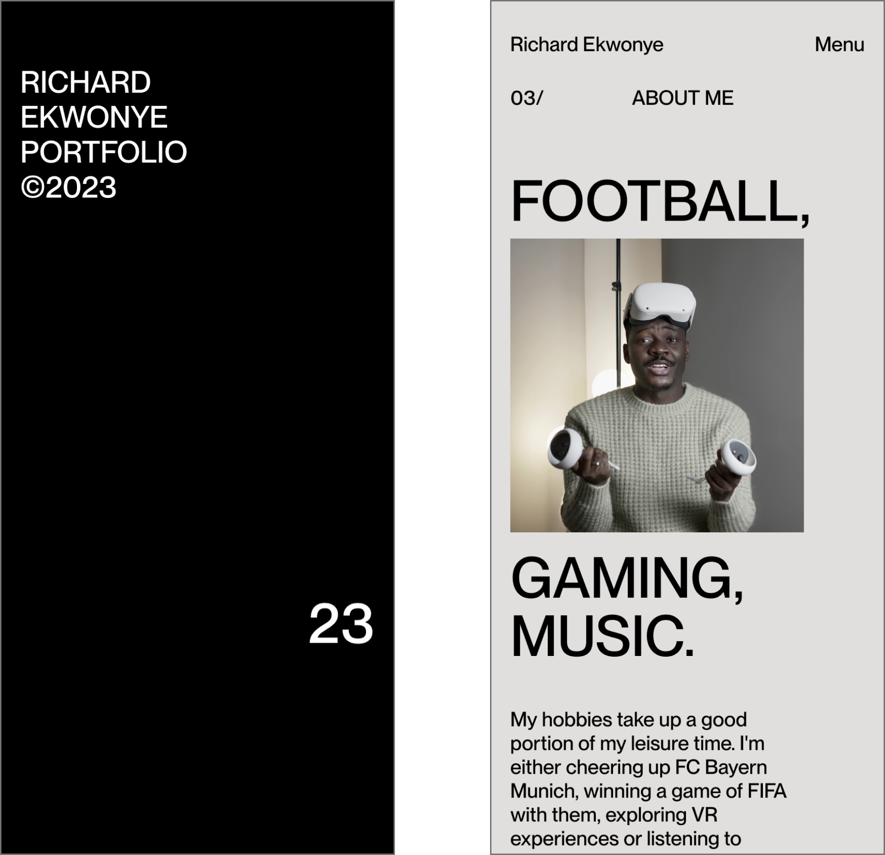
Richard’s portfolio is a simple portfolio that keeps the focus on the work by using big images. Besides focusing on the work, the site also has a subtle hint of personality which can be found in the micro-interactions and animations, this makes the site more unique to Richard.
URL: richardekwonye.com
Collaborator(s): Gil (Designer); Richard (Developer)
Tools: Custom build by Richard


Q&A
What did your concept ideation process look like for this project?
When Richard approach me to work on his site the first thing we did was getting clarity on the goals Richard had for his site. The biggest thing that came up is him wanting to get more creative development work. This gave me the copy to work with in the hero section. After exploring a couple of different layouts we got the idea of the sliding picture mask of him to add personality to the first screen the user sees.
How did you strike a balance between creativity and functionality in this website design or build?
For portfolio websites, it’s always best to let the work speak for itself and let the work be the hero of the website. I would name this the functionality part of the website. However what makes a good personal website is having small moments of delight for the user that makes it not only a more fun experience for the visitor but also a more memorable one, which can be beneficial when looking for a job for example.


What challenges did you have whilst designing/building this site?
We didn’t really have big challenges to overcome but one main thing we worked on a lot together was finding a solution to have the hero section work in a good responsive way so it would still stay effective on smaller screens.
What are some of your favourite elements/features on the site?
The sliding image mask in the hero section is for sure one of my favourites. Another one I still really like is the loading animation when the site loads for the first time where the number of the % moves up and position of the number resembles the % it is on. Besides that all the other micro-interactions like the cursor on the project hover etc, all brought to life very nicely by Richard.

What’s one new thing you learned during the entire process?
This project was really big for me on collaboration, in the past I’ve done projects where I just hand over the design to the developers and not much assistance was needed. With Richard’s website we both wanted it to be top-notch which resulted in going over everything together in detail which made for the best results.
If this website was a lead single, what song would it be and why?
Cool question haha. Never really thought about a song while designing a site but I like the angle haha. I would say ‘It’s alright’ by Jon Batiste from the movie Soul. The reason why I thought about this song is because the personality of the site reminded about the spirit of that movie around following your passion. Hope that makes sense haha.

Thanks for reading! Definitely reach out if you’d like to be featured or would like to recommend a site to feature.