
#019: Lagunitas
A masterclass in how to bring a brand to life using dynamic colours, textures and animations.
We’re back with a new edition of Web Wizards! I find that Food & Beverage websites always have the coolest and most unique designs, and this website is no exception. With cool parallax scroll effects and great typography and texture choices, this website is a fun adventure from start to finish.
Got a cool website you’d like to see featured? Let me know by replying to this email or reaching out.
An Intro
Jenny Johannesson is a freelance designer with a mixed background in the creative industry — from advertising in Amsterdam, to tech and startups in San Francisco. She is now based in Sweden, where she helps clients go from zero to hero, or helps take them to the next level through design.
➤ Socials: Twitter, Instagram, Behance
About the Site
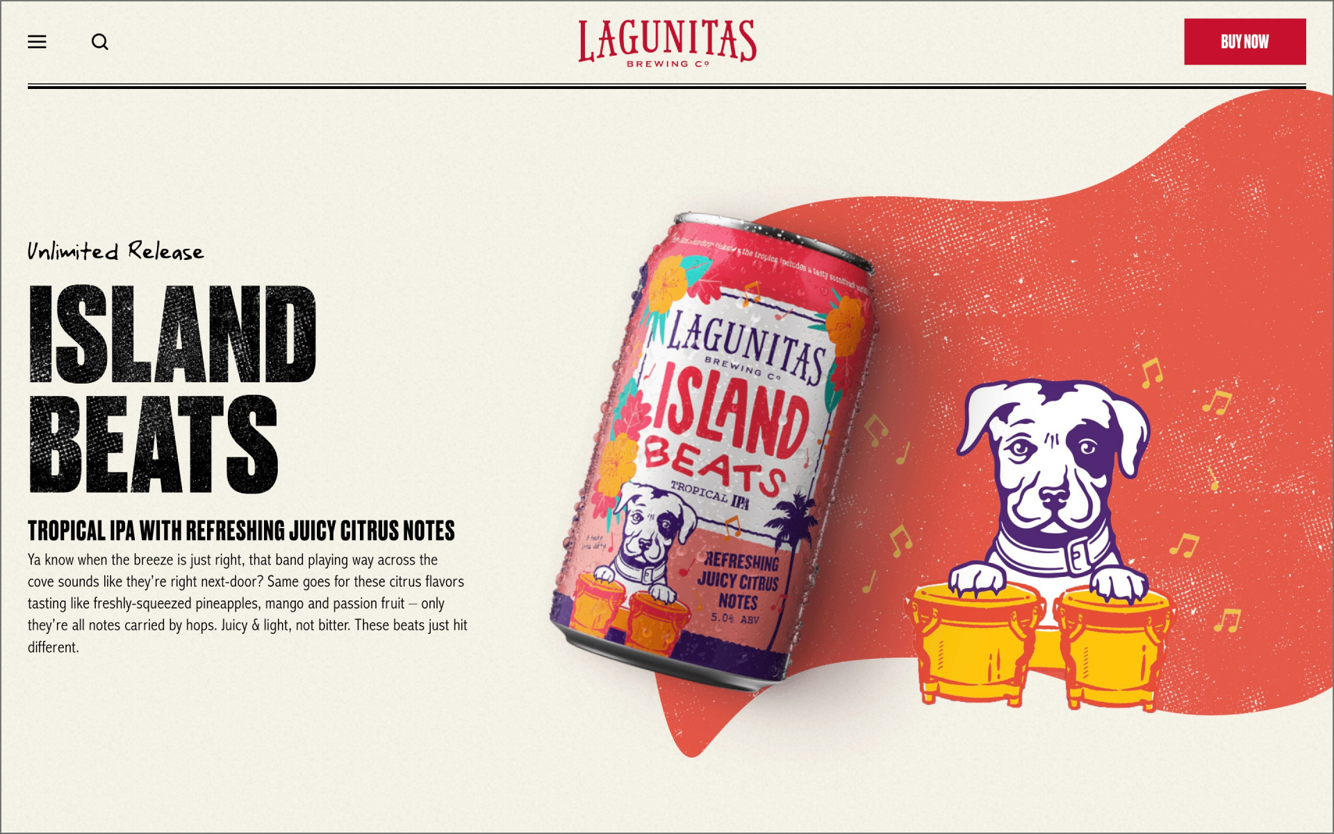
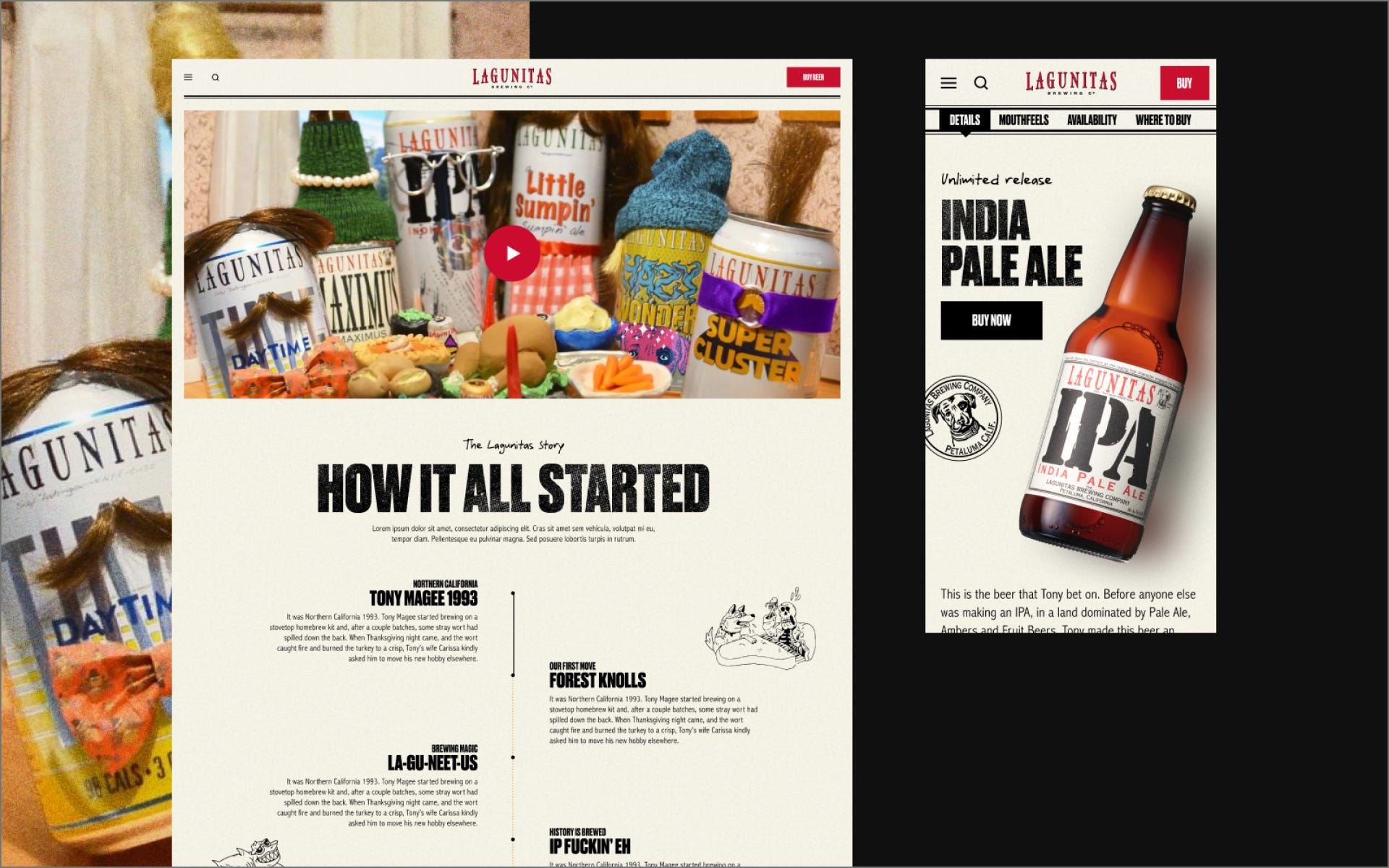
It was time for Lagunitas to get a new site, so they came with their whacky brand guide using typefaces like Copperplate, Abadi and something called “Yank”? Honestly, I was a bit worried but decided to accept the challenge! You gotta accept the weird to create something fun!
URL: lagunitas.com
Collaborator(s): Jenny (Design); Teak SF
Tools: I’m not sure, the client built it themselves. Probably from scratch

Q&A
What did your concept ideation process look like for this project?
I played around with a lot of textures, which can be a bit of a challenge in Figma. But I was literally ripping paper into pieces and scanning them in. My tip is to use colored papers, you get better contrasts (I used blue!)
How did you strike a balance between creativity and functionality in this website design or build?
Functionality really came first, the rest is really just layout and design elements dressing up the pages. The product pages are sticking out from that though, but the challenge here was to fit a lot of information while keeping the page fun and interesting.


What challenges did you have whilst designing/building this site?
See previous answer :)
What are some of your favourite elements/features on the site?
The parallax beer bottles/cans on the product pages!


What’s one new thing you learned during the entire process?
That I don’t always need to fear unconventional typefaces (I wouldn't pick these myself though)
If this website was a lead single, what song would it be and why?
“Wouldn’t it be nice” by The Beach Boys, because it has a very happy vintage California vibe!

Thanks for reading! Definitely reach out if you’d like to be featured or would like to recommend a site to feature.