#017: Mocha Cafe and Bar
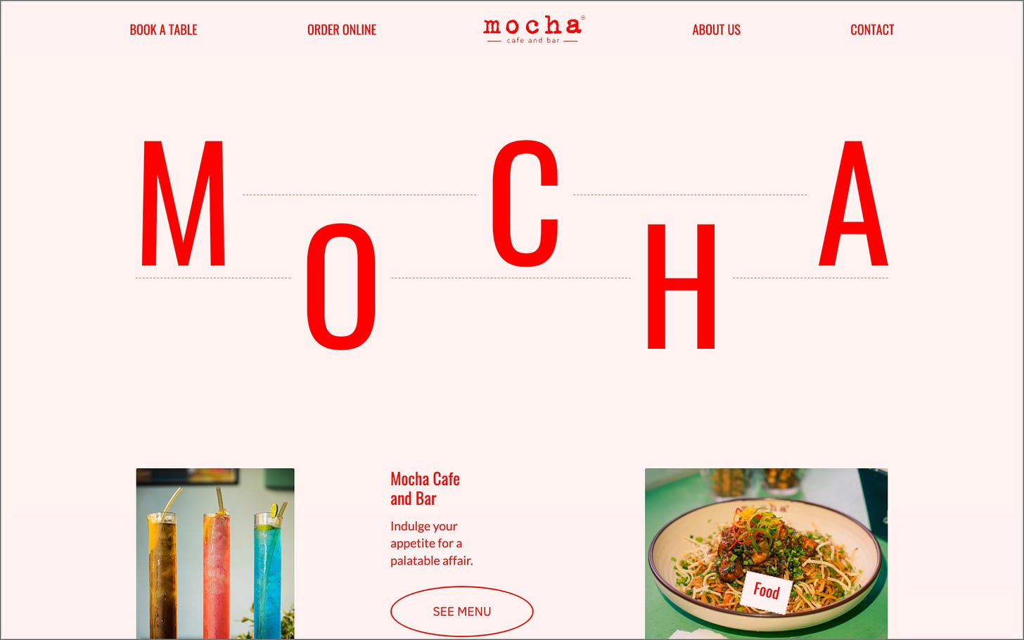
A cute cafe website that takes you on a fun ride with its abstract layout and gorgeous food photography.
We’re back with a new edition of Web Wizards! Even abstract website designs have logic behind them, and today’s feature goes into detail on the mechanics behind using imperfect details to create a perfect outcome.
Got a cool website you’d like to see featured? Let me know by replying to this email or reaching out.
An Intro
I (he/him) am a civil engineer turned graphic designer. I began my journey in design while I was in college. After graduating, I freelanced for a while before starting my own web design firm. We, now, have a team of 12 creative minds including designers, developers and content writers.
➤ Socials: Instagram
About the Site
We built this for Mocha Cafe & Bar, a cafe in Guwahati, India. It was also released as a community project on Webflow so that anyone can use it as a template.
Collaborator(s): Entirani & Nambashisha (Webflow Developers)
Tools: Webflow
Q&A
What did your concept ideation process look like for this project?
We were inspired by a 6-column grid layout on an exhibition poster of Japanese designer Takenobu Igararashi. To begin, we started setting up a modular grid on a base frame of width 1512 pixels.
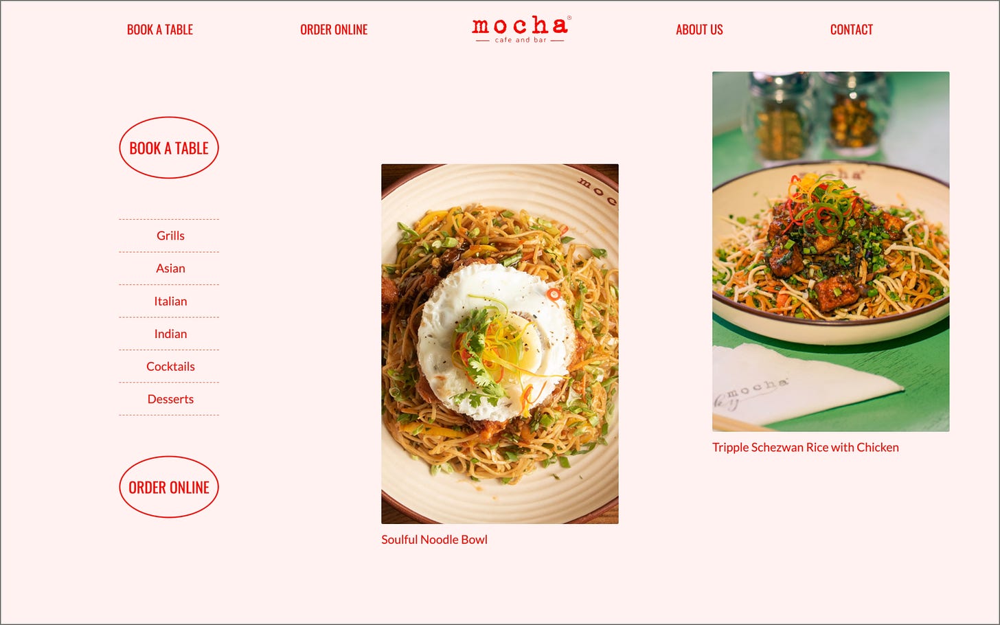
We, then, started to build optical rhythm between the blocks formed by the grid, alternating between Big typography, images and dotted lines. To get more into rhythm, images were named according to their sizes (Big image - A, Small landscape image - B, Portrait image - C). Then we set a rhythm of C,B,A on the header followed by A,B,C for the rest of the website and a rhythm of A,B,B in the menu. The placement of images themselves follows a pattern of mirror imaging a certain rhythm on itself (for eg. the menu section). The graphic marks, shapes, typography and colors we chose are designed to give the flavor of a traditionally designed restaurant menu.
How did you strike a balance between creativity and functionality in this website design or build?
Because creativity in vertical rhythm between image sizes, text and lines was the foremost focus, functionality became a challenge. We wanted to experiment but not make it look disjointed to the extent that the content and context were lost.
The initial draft of the design was sent out to our team. We wanted to observe if everyone read and experienced the website the way it was intended to. Needless to say, some parts of the initial design went way too much on the side of abstraction. We came to know this when we asked participants to read the entire web copy out loud and some were read in a jumbled manner. After the first user feedback, we went back to our drawing boards and had to scale back some extremities in design.
The second draft dealt with what our fellow designers felt about the design. The feedback that came back inclined towards rigidity. We felt that we were so obsessed in achieving rhythm within the grid that the design was turning more rigid and was devoid of fun. We then got our team to figure out ways to break the rhythm, so it felt more human.
What challenges did you have whilst designing/building this site?
The biggest challenge was striking a balance between a rigid grid, human imperfection and ease of readability in traditional web design. This was so challenging that just sprinkling human imperfection across the site took us 2 weeks of drafting with 3 designers.
What are some of your favourite elements/features on the site?
The dotted lines, moving text, oval buttons(which turn dotted on hover and text inside starts moving). We also loved that any user who sees our website can tell that it follows a unique rhythm and yet can’t put their finger on why it feels warm and human at the same time.
What’s one new thing you learned during the entire process?
When we began, we thought just naming image sizes, text sizes (A,B,C etc.) and treating the grid as content blocks and then attempting to achieve poetic rhythm was enough to create something people rarely saw on the web. However, we realised pretty soon that websites look different because they feel different on the eyes. Feeling is much more subjective and difficult to gauge.
If this website was a lead single, what song would it be and why?
Daft Punk - Something About Us. I think it’s kind of self-explanatory haha.
Thanks for reading! Definitely reach out if you’d like to be featured or would like to recommend a site to feature.


