


#018: Callista Rose Bay
Sometimes it's important to let the visuals speak for themselves.
We’re back with a new edition of Web Wizards! This website lets the visuals do most of the talking, and it pays off really well. I’m super excited to share an amazing site that features dynamic animations and gorgeous architecture shots, all while maintaining a smooth user experience.
Got a cool website you’d like to see featured? Let me know by replying to this email or reaching out.

An Intro
Hi there! My name is Ilja van Eck, I design and build next-level Webflow experiences.
➤ Socials: Twitter, Instagram, LinkedIn, Website
About the Site
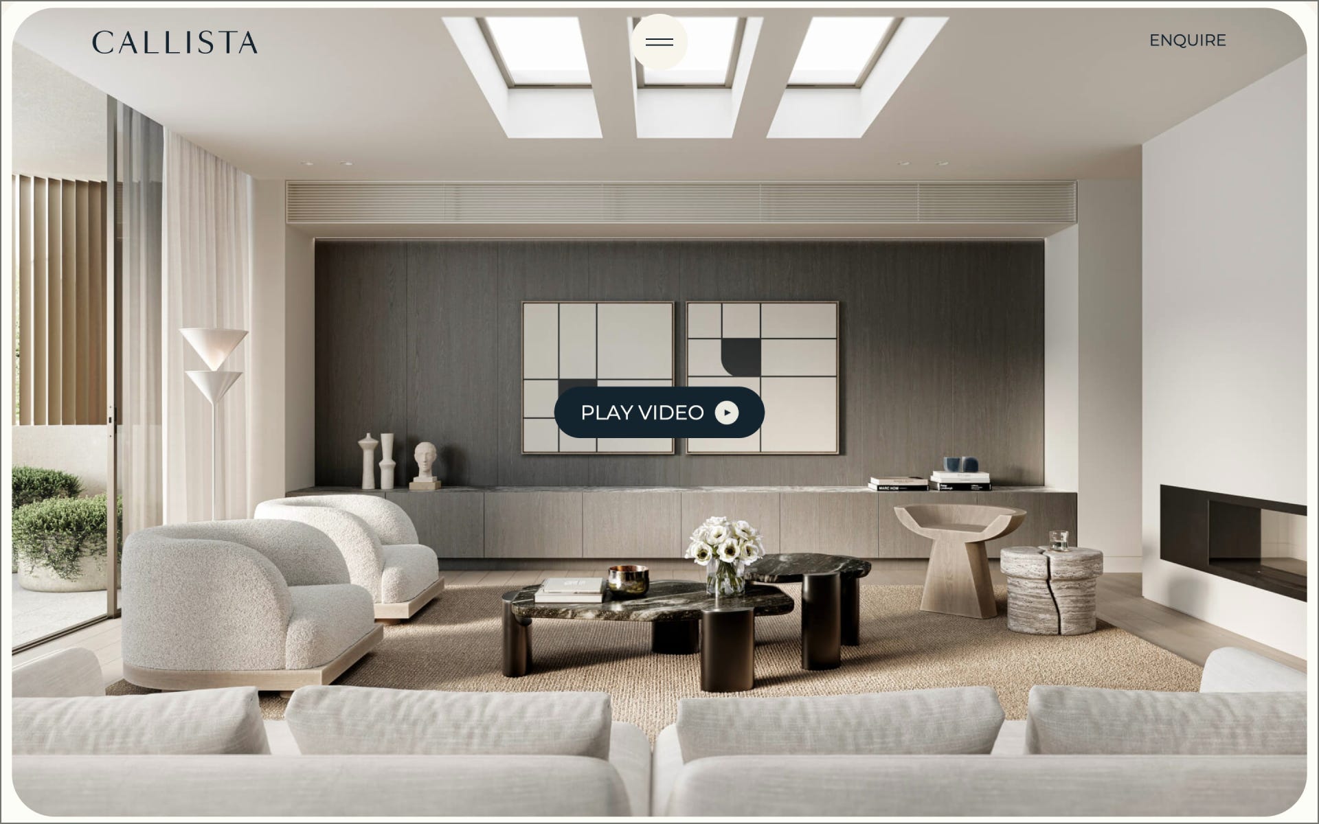
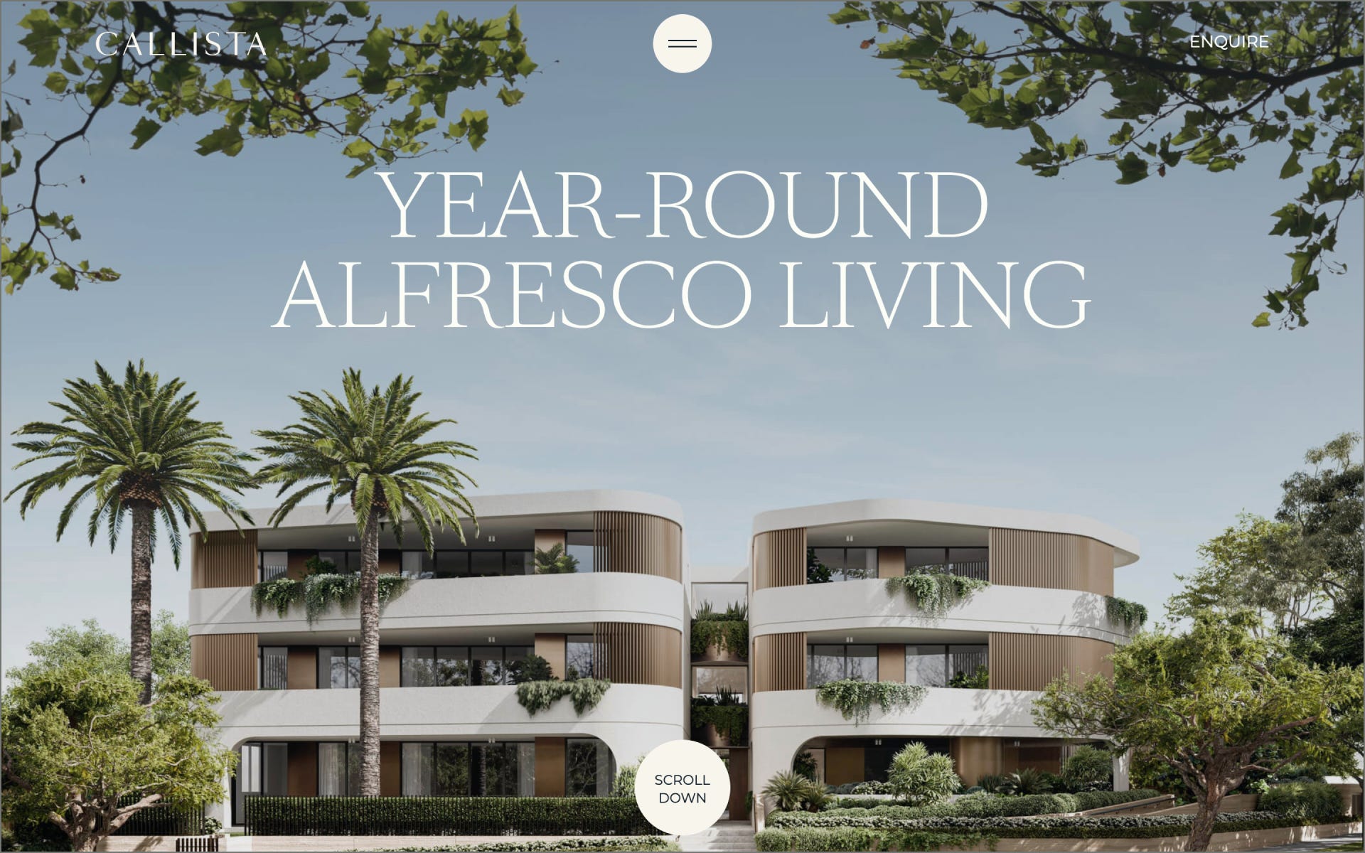
Callista is a residential development in the exclusive Rose Bay area in Sydney. The website is crafted to highlight the high-end quality of the project using animated imagery, video, and subtle animations. Its main goal was being a visually engaging experience for the considerable amount of online traffic, interested in enquiring.
Collaborator(s): Ilja (Design/Development); Third Aesthetic (Branding/Marketing/CGI)
Tools: Webflow, custom JavaScript, Make (Integromat) and Notion to collect enquiries

Q&A
What did your concept ideation process look like for this project?
The overall direction in terms of colour, typography and visual elements were already defined by Third Aesthetic, the agency behind the branding marketing, branding, and CGI. When they reached out to me, everything was pretty much in place to start thinking about the flow of the site. One of the first things I did was organizing the types of content we had, and mapping out how things would appear so the story would make sense. With that in place, it’s much easier to start designing, since you now have an overview of what copy and content comes per section.
Speaking of that, we made a deliberate choice to not have a lot of copy on the website. Simply because the website wouldn’t be the first touchpoint in the customer journey (for most, of course). People would get to the site after receiving a brochure, or marketing email for example. The site would be just another opportunity for us to have the visitor emotionally connect to Callista using imagery, video and animations.
From very early on in the design phase, I was discussing ideas for motion throughout the site, as that would be a key factor later during development. I was fortunate that the great team at Third Aesthetic hardly needed any visual prototypes for these motion ideas during the design phase, and was fully on board after some spoken explanations.
How did you strike a balance between creativity and functionality in this website design or build?
By keeping in mind what the end goal is: Getting people to enquire about the properties. Of course, it’s important that we do this through a visually pleasing and engaging experience, but it’s vital to remember who and what you’re making something for.
Using well-considered animations throughout a site is a great way to bring life to otherwise very static text and imagery, but it’s an easy mistake to overdo it.

What challenges did you have whilst designing/building this site?
The target audience wasn’t very young – as most younger people wouldn’t be able to afford such a property or be drawn to this neighborhood. Therefore, it was key to have clearly distinguished sections and pages for the users to discover, and guide them through Callista step by step. But, as mentioned a couple of times, the online experience had to live up to the high-standards of the project.
What are some of your favourite elements/features on the site?
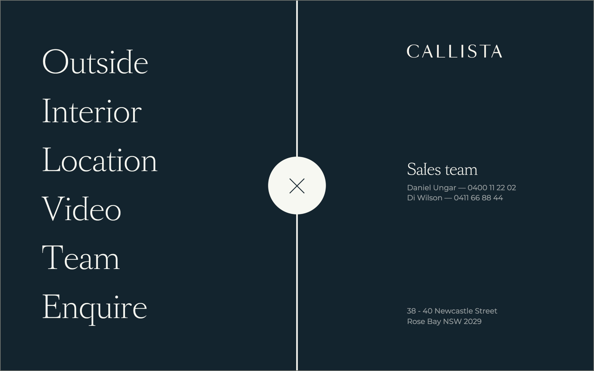
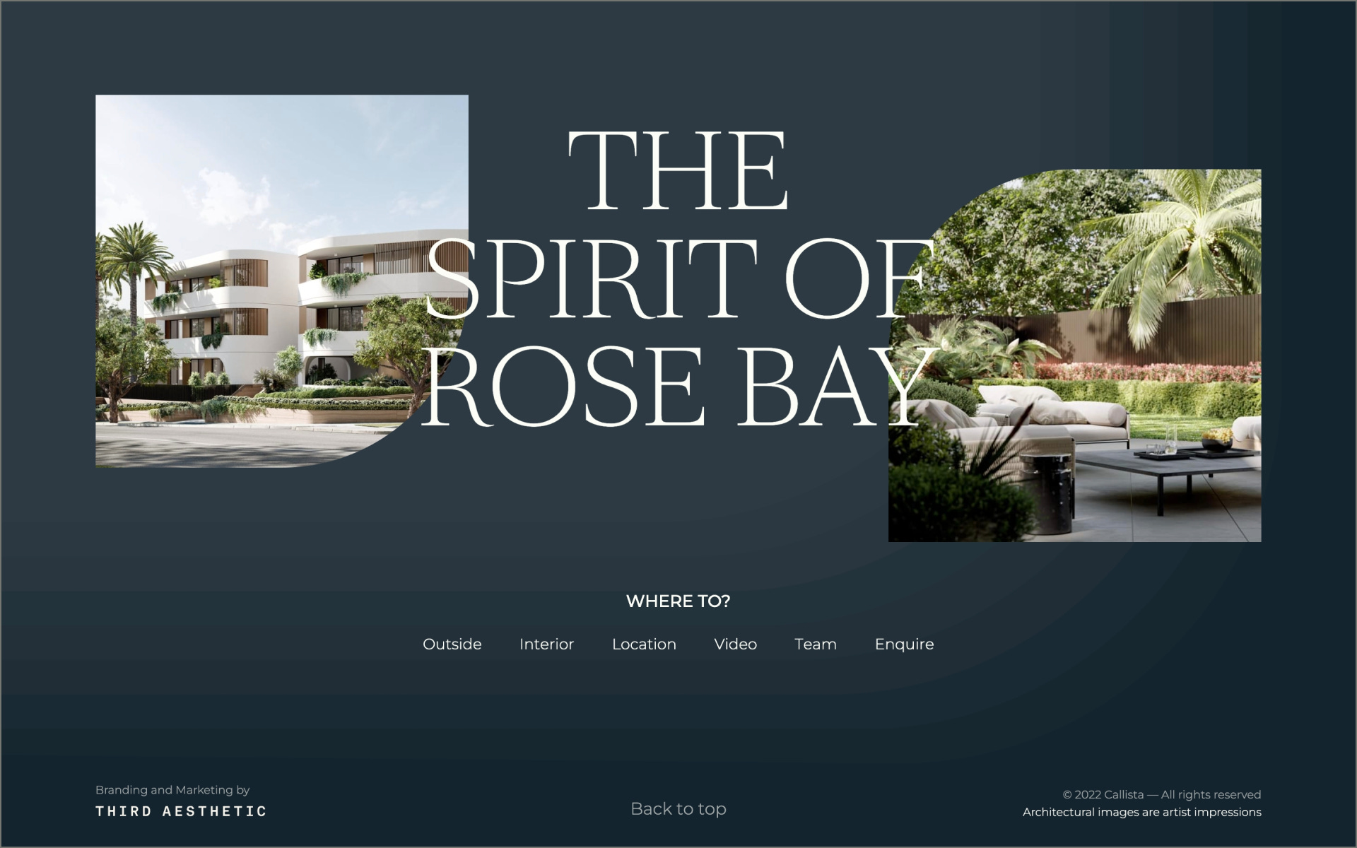
I’d say the ‘curtain-like’ page reveals and menu transition, which came from the idea of revealing the beautiful construction photos – which is all 100% done with CGI, by the way. Except for the photography you see of Rose Bay itself, everything is computer generated. Which, a year later, still blows my mind. Not with Midjourney by the way, this is craftsmanship :)

What’s one new thing you learned during the entire process?
It was my first time dabbing around in GSAP and some more custom JavaScript. Which was really fun, and has definitely set the tone for the year that followed. It just opened my eyes to the possibilities that adding some code into a no-code site gives you. Now of course, what you see on Callista wasn’t very advanced yet, but it did raise my curiosity for that more advanced work.
If your creative process for this project had a lead single, what song would it have been and why?
Hmmm, I’d say Experience, by Ludovico Einaudi. Not necessarily for the song’s name, but because of the moving and soothing nature of the song. I feel like the title of the song implies that it’s about the concept of experience – our personal journeys, our memories, and how our experiences shape who we are.
Thanks for reading! Definitely reach out if you’d like to be featured or would like to recommend a site to feature.