#016: Mars Rejects
An interactive site that takes you through a graphic novel-like experience, bringing to life the story and characters.
We’re back with a new edition of Web Wizards! Ever thought of how to bring a graphic novel to life in website form? Today’s feature is a creative exploration on how to do just that, and the final product is an amazingly immersive experience that sucks you right into the narrative. Let me say less and let you learn about the Mars Rejects for yourself.
Got a cool website you’d like to see featured? Let me know by replying to this email or reaching out.
An Intro
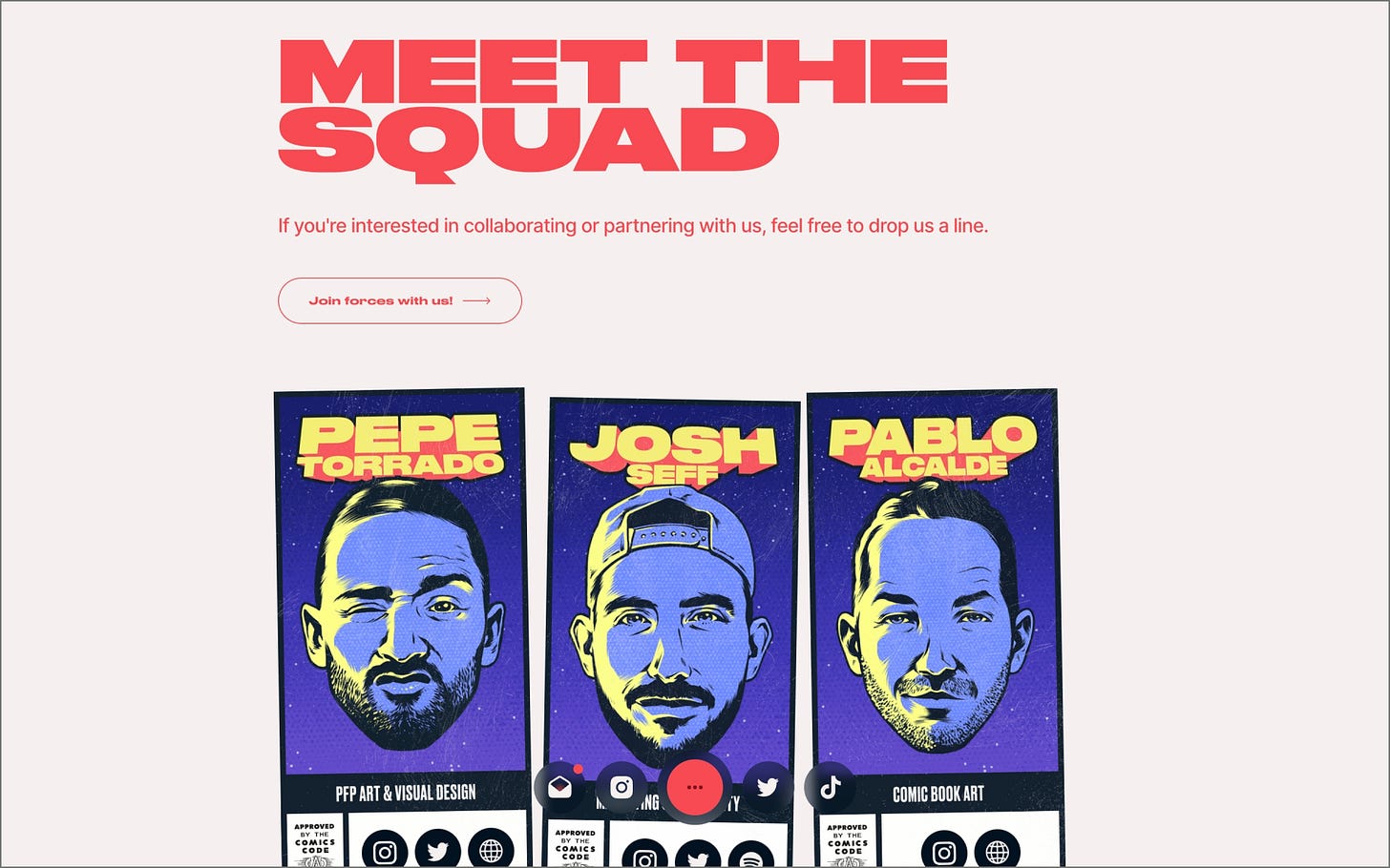
I’m a Spanish-born multidisciplinary designer and illustrator based in Brooklyn, New York.
➤ Pepe’s Socials: Linktree
About the Site
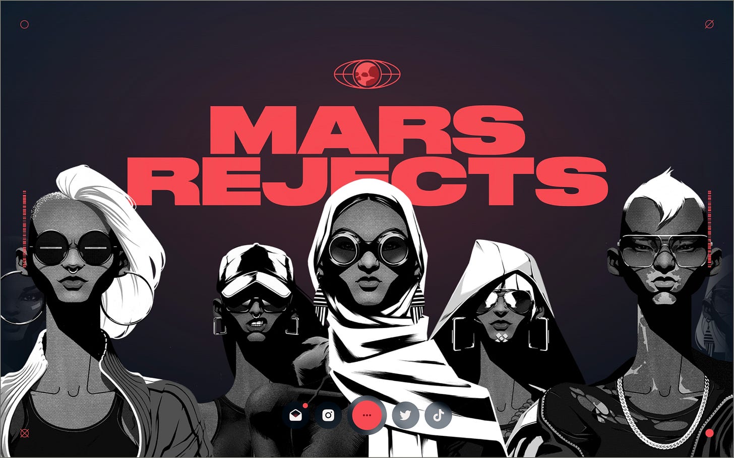
A unique collection of 10,000 characters brought to life as NFTs. Created by Pepe Torrado, The Mars Rejects live in a universe crafted by their own community.
URL: marsrejects.com
Collaborator(s): Pepe Torrado (Designer/Developer)
Tools: Framer
Q&A
What did your concept ideation process look like for this project?
The idea for Mars Rejects, started with a chat I had with a friend about the colonization of Mars, in the event Earth becomes unlivable and the relocation of Earth’s population is necessary. I started to think about the potential challenges and impact on society. It’s hard to trust that a company or organization that has the power to lead the transition from Earth to Mars, has everyone’s best interest in mind. The ideas began to flow around what this new reality would look like.
To bring this idea to life, I thought a graphic novel narrated from the perspective of the people left behind on an increasingly industrialized Earth would be a great starting point. I started writing the story and sketching the characters. Since they would be representing people from all over the world I wanted to make them as diverse as possible, and to achieve that I opted for creating them on a generative art tool, where all my hand-drawn assets could be combined programmatically. I really like what Bueno is doing making the digital art world more accessible for artists, and I enjoy using their platform.
Explaining the complexity of this project was what drove the creation of this site, to make it easier for myself and others to understand. I already created a ton of visual material, that the idea of making a site to share the vision, was really exciting. My goal was to create an immersive experience that provoked an emotional reaction to the story and characters while highlighting the art details. I outlined the story and designed the layout in Figma, then I exported it to Framer, where I added the animations and micro-interactions. Through patience, trial and error, and several iterations later, I was able to bring the Mars Rejects story to life.
How did you strike a balance between creativity and functionality in this website design or build?
It wasn’t easy at first. As a commercial product designer I always think about the user experience, being easy and straightforward but as an artist I want people to spend time on the site, explore the details and discover unexpected content. It took a few iterations to find the balance between those 2 contradicting factors, but one thing I always do regardless the project is commercial or personal is to test it with family and friends. That’s where the true breakthroughs and ideas arise, and that continued to shape the direction of the site.
What challenges did you have whilst designing/building this site?
I had to make the tough decisions to remove features due to browser performance issues. This project is mainly visual, and you want to showcase it with big, high-resolution images, videos and animations. I had to optimize everything to the maximum to make it light enough, and I had to give up a few interactions that were too demanding. For example, the opening was a multilayered 3d earth that rotated as you scroll, it was very cinematic, but sadly that had to go.
What are some of your favourite elements/features on the site?
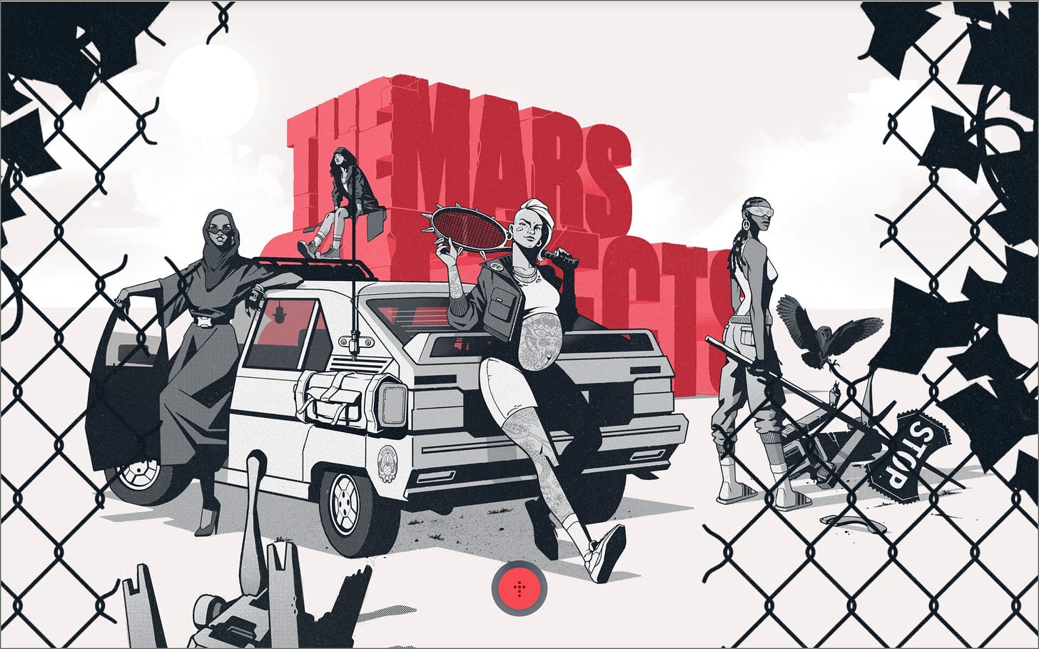
My favorite part is the parallax illustration highlighted at the end of the site. I wanted to make the experience interesting from beginning to end, so I like the idea of finishing the experience by bringing the story to life with a scene that brings characters together and gives a sneak peek on the comic book art direction.
What’s one new thing you learned during the entire process?
This experience taught me the importance of community support when learning a new tool. I started using Framer a few months ago and at that time, there weren't many resources available, so my progress was slower. As time went on, the Framer community grew exponentially, providing me with an opportunity to connect with others, learn from their experiences, and access more resources, which helped accelerate my workflow.
If this website was a lead single, what song would it be and why?
One song that comes to mind is Born Free by M.I.A, the antisystem vibe of the whole MAYA album pairs very well with the story we are trying to tell.
Thanks for reading! Definitely reach out if you’d like to be featured or would like to recommend a site to feature.


