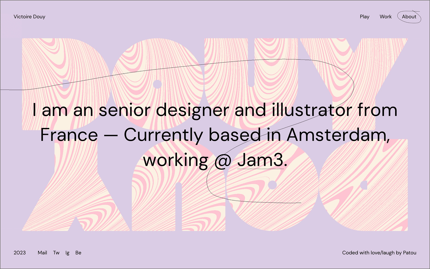
#015: Victoire's Portfolio
Another fun-packed portfolio with cool interactions and amazing creativity.
We’re back with a new edition of Web Wizards! There’s no better opportunity to be experimental and random than on your own portfolio. Victoire’s portfolio is the perfect example of how to show off your creative talent in a unique and interactive way. From interacting with fun squiggly lines to playing around with the homepage shuffle mode, there are a lot of neat interactions on this site.
Got a cool website you’d like to see featured? Let me know by replying to this email or reaching out.
An Intro
I am an Interactive Designer and illustrator, based in Amsterdam. My work is guided by colors and storytelling, and informed by my day-to-day inspiration.
➤ Victoire’s Socials: Behance, Instagram
About the Site
URL: victoiredouy.com
Collaborator(s): Victoire (Designer); Patrick Heng (Dev/Animation)
Tools: HTML, CSS, WebGL
Q&A
What did your concept ideation process look like for this project?
I wanted my portfolio to be unique and memorable. There are lots of portfolios out there, so I wanted it to feel unique. I was lucky to create it with a good friend, who really knows me and could capture my identity, and hopefully my wit!
How did you strike a balance between creativity and functionality in this website design or build?
I think the balance is found in the case studies. Even though the site has a strong personality, each case study feels unique and focuses on the projects.
What challenges did you have whilst designing/building this site?
It's always a struggle to show your work. I am always questioning how I am perceived based on my portfolio. It was a bold choice to go in a very illustrative direction since I am an interactive designer. So the challenge is to convey how I can visually adapt to different projects/clients while having my own identity and a voice that I cultivate. It can be difficult for designers who do illustration because art and design are two very distinct forms of creativity and very different skills.
What are some of your favourite elements/features on the site?
I love that there's a surprise element with the play section and that you can have some fun with it. It's very important for me to not take things too seriously and have fun with my work, so I hope people have a little smile while experiencing it!
What’s one new thing you learned during the entire process?
Collaboration with dev is key. I love to work with creative devs because they always bring life to my work, Love working with my friend Patrick, he's so talented!
If this website was a lead single, what song would it be and why?
Love that question!! Honestly, it has to be something with a good rhythm, something punchy that stays on your mind -and I listened to that song A LOT the year my portfolio came out- so it has to be "Glue" by Bicep.


