


#014: Oraimo Freepods
Sleek. Modern. Cool. The first three words that come to mind with this website.
We’re back with a new edition of Web Wizards! It’s not a stretch to say that a lot of modern tech websites are leaning more toward cool and sleek interfaces. Think Apple. Today’s site demonstrates how to design a minimal and sleek website around a product, using gradual scroll interactions and 3D animations to highlight the product from all angels.
Got a cool website you’d like to see featured? Let me know by replying to this email or reaching out.
An Intro
Hi, I’m Eniayo Bamidele (he/him). A creative product designer and a Webflow developer.
➤ Eniayo’s Socials: Twitter, LinkedIn, Medium
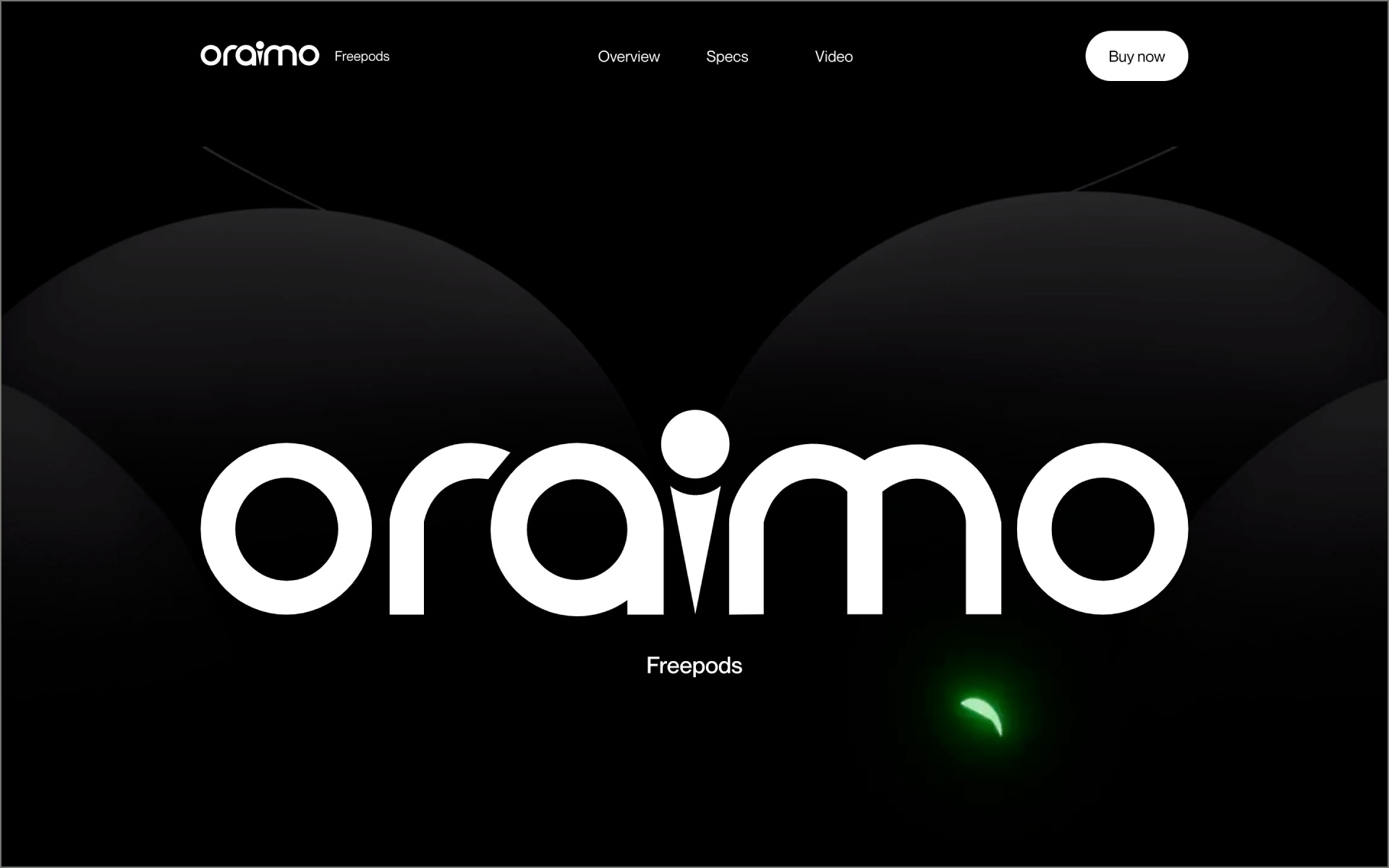
About the Site
A product exploration page for Oraimo. Created a similar model of the real product in blender, designed the site with Figma and developed it with Webflow.
Collaborator(s): Eniayo (Designer/Developer)
Tools: Webflow, Figma, Blender


Q&A
What did your concept ideation process look like for this project?
Firstly, I conducted research on the target audience, company, and competitors (Apple Airpods and iPhone to be precise). Based on the little information gathered, I developed a mood board and wireframes to present a visual representation of the design concept. From there, I created a model on Blender and created a webpage design for the product.
How did you strike a balance between creativity and functionality in this website design or build?
Striking a balance between creativity and functionality was a key consideration throughout the design and development process. The website needed to be visually appealing and engaging to users, while also being intuitive and easy to navigate. To achieve this, I used clean and simple design and cool storytelling animations.


What challenges did you have whilst designing/building this site?
The sole difficulty encountered was developing the model using Blender. I had to allocate a considerable amount of time to learn the tool, which required over 14 days to understand its interface and model the product. An additional obstacle arose when rendering the animations in After Effects.
What are some of your favourite elements/features on the site?
The scroll interactions are my favorite.


What’s one new thing you learned during the entire process?
Asides from the new tool (Blender) I added to my creative arsenal, I also discovered how a nice and detailed product showcase can increase the sale and user engagement of that product.
If this website was a lead single, what song would it be and why?
This girl (site) is on Fire - Alicia Keys
