#012: Sam Bufalo's Portfolio
Depicting the story behind every image through nuanced writing, layouts and colors.
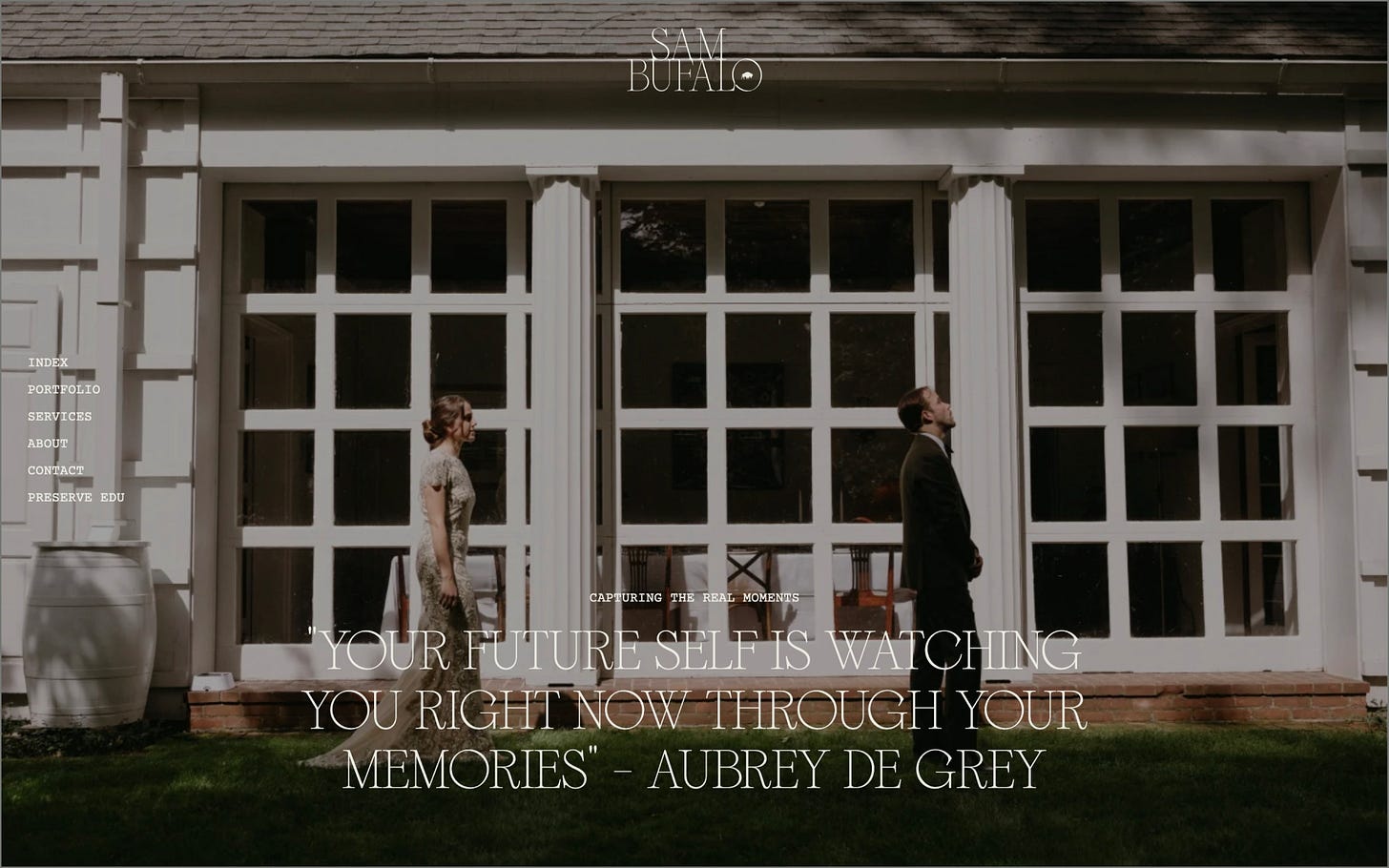
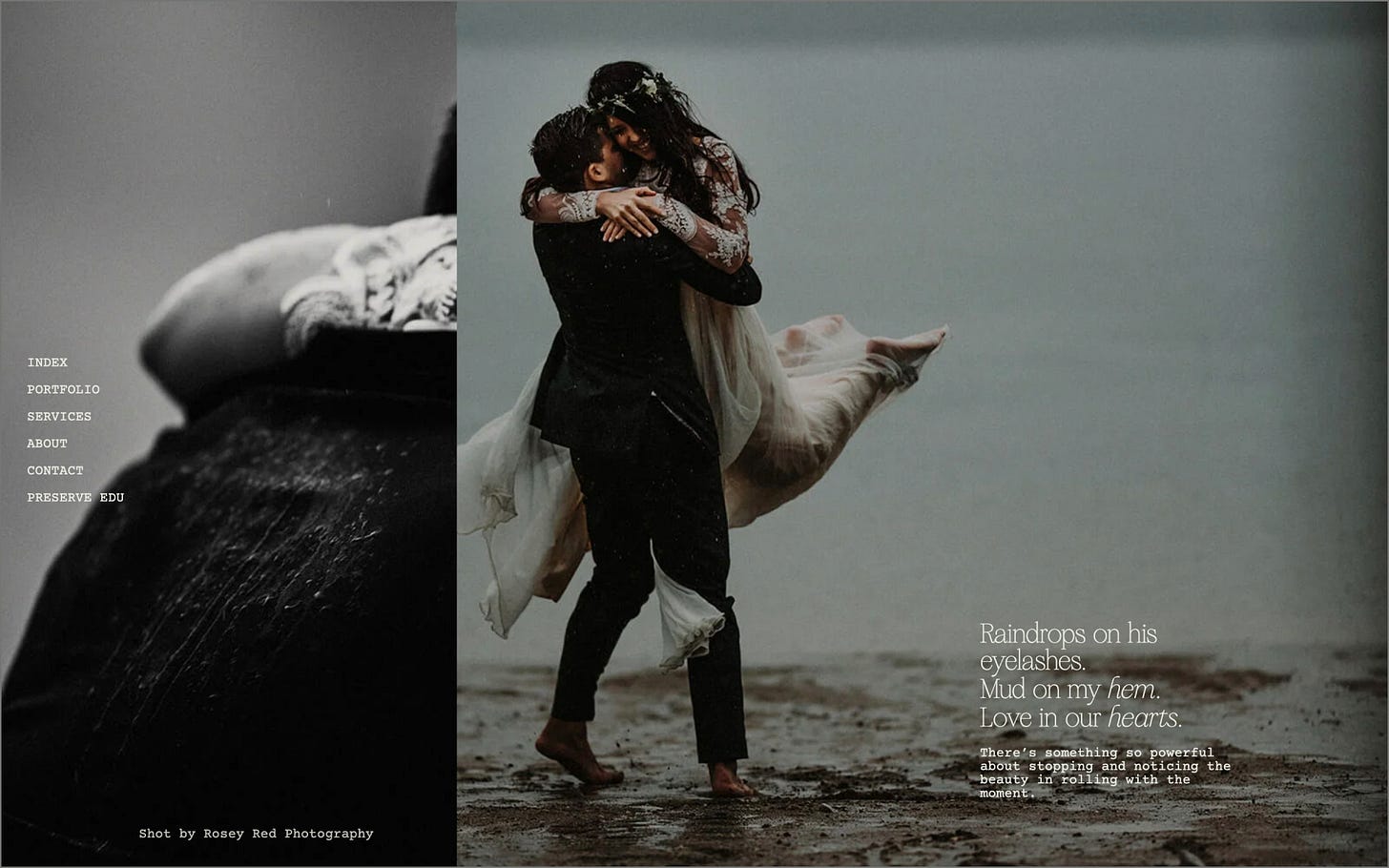
We’re back with a new edition of Web Wizards! There is something so magical about conveying emotion and depth through visual design. This site does a phenomenal job of creating a sense of nostalgia from the images featured through the subtle nuances in layout, typography and color grading.
Got a cool website you’d like to see featured? Let me know by replying to this email or reaching out.
An Intro
Hi, my name is Nkenna Amadi, Lead Creative Web Developer & Designer at The Blackpepper Studio (TBP).
➤ Nkenna’s Socials: Twitter
About the Site
The website was a portfolio for Sam Bufalo, a documentary wedding and family photographer based in Stamford, CT.
URL: sambufalo.com
Collaborator(s): Nkenna (Designer/Developer); Asmah Williams (Brand Identity)
Tools: Webflow
Q&A
What did your concept ideation process look like for this project?
The creative direction for the website was built upon the foundations of the brand identity that was developed in-house. The identity had been carefully designed to evoke moments inspired by nostalgia, old footages and the imperfections you get when working with film while creating a clean modern brand look. The colours serve as an extension of the photographs, they are designed to transport and retain you in the world of Sam Bufalo when used on a layout.
With her photography revolving around motherhood and wedding, two pivotal experiences that ideally should be remembered fondly, it was vital that the art direction reflected those feelings. Copy in the form of poetry, layout and composition were some of the carefully curated elements utilized to evoke those feelings. For example, there was a deliberate choice to hardly use any full bleed imagery on the website, as you would associate that more with commercials and editorials. As you viewed the images and videos, you were reminded of how they looked in a catalogue or displayed on your nightstand, paired together to revive the memories.
Another part of the creative direction that stemmed from the brand identity was the use of circles. Circles were used as symbols of a camera lens as well as portals into another world.
How did you strike a balance between creativity and functionality in this website design or build?
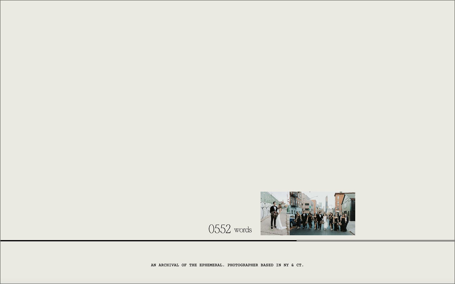
By placing a dominant focus on the copy and breaking down the website into sections that I prefer to call information centres/blocks. So in essence I started from a blank canvas with copy put into these different blocks, then paired the copy with visuals that help convey the information, only then was the exact animation/transition flow considered. Hence if the javascript was turned off, the copy and images that have been grouped together into these information blocks are enough for the users to get a literal and visual sense of the webpage.
What challenges did you have whilst designing/building this site?
The website had three primary targets: mothers/families, couples who are about to wed and parents who wanted to learn photography and film from Sam. The key challenge was finding a visual balance on speaking to all 3 equally and still getting the message and content across.
What are some of your favourite elements/features on the site?
The preloader idea and the subsequent transition to the homepage. The seamlessness of it was an aha moment. I believe the way it was executed allowed visitors to easily understand who she was and highlight the work she’s done in the first 5-10 seconds.
What’s one new thing you learned during the entire process?
How to grade images on the fly. On the individual portfolio pages, all the images are colour graded dynamically via javascript, and serves as the main thing you see as you scroll before the images are revealed. This helps give a sense of the richness and depth of the images.
If your creative process for this project had a lead single, what song would it have been and why?
Young Forever - Beyonce and Jay Z because of the emotions and moments you get to relieve when listening to that song.
Thanks for tuning in to this edition of Web Wizards! Definitely reach out if you’d like to be featured or would like to recommend a site to feature.
Till next time ~


