#011: Via's Portfolio
Experience a blast to the past through the retro pixel aesthetic of this portfolio.
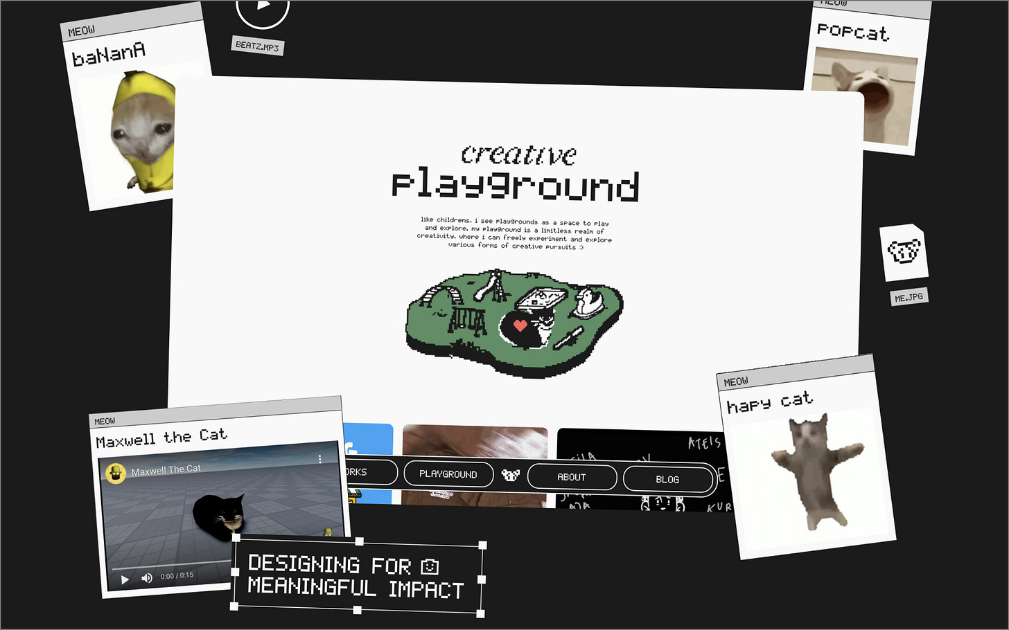
We’re back with a new edition of Web Wizards! Out with the old, in with the new, or in this case, recycling the old as new. Today’s website is an epic mashup of retro pixel elements, resulting in a personable and unique design style for a portfolio. It’s always fun to see people take old browser and desktop concepts and reimagine them in a more modern style, and this website does so amazingly well!
Got a cool website you’d like to see featured? Let me know by replying to this email or reaching out.
An Intro
Hi everyone! My name is Via (she/her), an Indonesian designer who's passionate about building and exploring her creative playground. I am currently playing in between design, tech, and social, where my interest lies in research, hcd, illustration, and writing!
➤ Via’s Socials: LinkedIn, Twitter, Website
About the Site
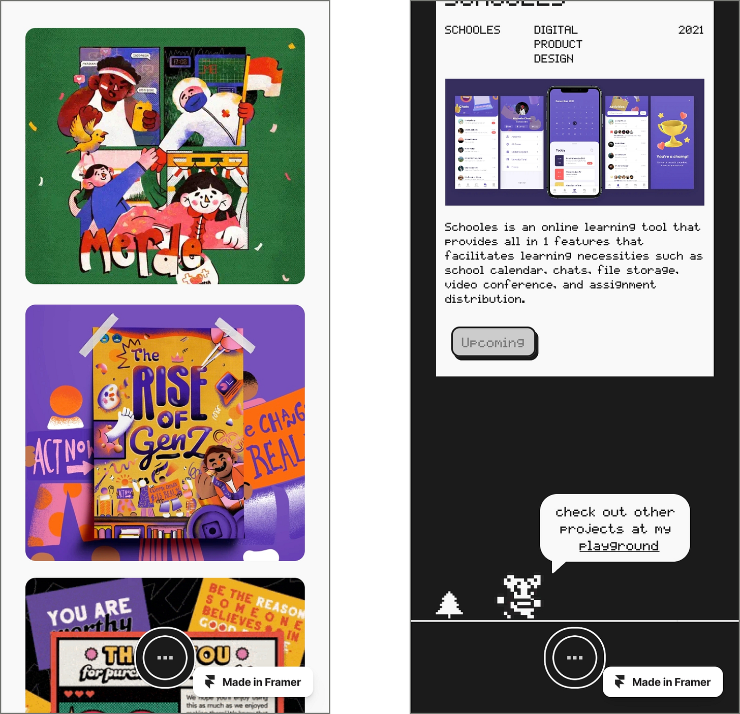
This portfolio website is an extension of myself that reflects my philosophy and passion for design. Inspired by retro pixel aesthetics fused with a twist of fun and witty elements, I aim to highlight my personality as a person and showcase my expertise in UX design by spotlighting my case studies and demonstrating my diverse skill set and love for creativity through the projects featured on my playground page.
Collaborator(s): Via (Designer/Developer)
Tools: Framer & Figma
Q&A
What did your concept ideation process look like for this project?
My love for retro pixelated arcade games was the main inspiration behind the concept of my portfolio website design. After discovering the iconic Teenage Mutant Ninja Turtles game in 2020 despite its original release back in 1989, I knew I wanted to bring back the pixelated vibe to the modern digital world. While my initial plan was ‘trying’ to create a game, I decided to showcase my admiration for retro games through my portfolio as a first step. Since my previous web builder subscription was also expiring soon, I saw this as the perfect opportunity to try out Framer, which allowed me to experiment and bring my ideas into reality.
This portfolio project was also my first attempt at using Framer, hence the process of building it was pretty messy as I was still trying to explore and tinker with the software’s tools, leading to a lot of trial and error. Visual and interaction-wise — I drew inspiration from a variety of sources, such as retro gameplay channels on YouTube like NintendoComplete and MamePlayer, as well as the website Version Museum to get a feel for how the internet looked before I was born. Furthermore, I also scoured through modern designs and interactions on platforms like Framer Awards, awwwards, and godly.website. All of these references and ideas help fueled my creativity and inspired me to explore different ways to design my website using Framer. I experimented with multiple iterations until I found the final design that truly represented my vision.
How did you strike a balance between creativity and functionality in this website design or build?
My approach to striking a balance was through trial and error. As someone who is still new to Framer, I knew that I still had many things to learn like understanding the tool's limitations and how far I could explore my ideas creatively while still maintaining the site's functionality. Thus, instead of diving straight into designing creatively on Figma, I preferred to realize bits of my ideas in Framer first to ensure they were feasible and functional enough. If it wasn't, I tried to find a workaround by either altering my idea or seeking help online (Framer has a ton of free resources to learn on Youtube and Twitter). Keep in mind, at this stage I only created a simple concept prototype to test whether my main idea was viable. Overall, it was a matter of jumping back and forth between Framer and Figma to determine whether things worked or not.
What challenges did you have whilst designing/building this site?
The biggest challenge for me was learning how to use Framer while simultaneously trying to make the website work. As someone who was new to Framer, I had to spend quite a time familiarizing myself with responsive design, its tools, and its layout. However, I saw it as an enjoyable challenge to learn a new design tool so it’s not something burdensome! Aside from that, another minor challenge was actually taking breaks. As a maker, I can get too immersed in my work and forget to take care of myself haha, so that’s a challenge I had to overcome.
What are some of your favourite elements/features on the site?
Definitely the homepage and the hidden easter eggs! I really enjoyed sprinkling personal touches throughout all the pages of my portfolio, as it was fun to incorporate fragments of myself in creative ways. I don’t want to spoil any of the surprises, as I want you to explore the site and see if you can find one :D!
What’s one new thing you learned during the entire process?
There are actually several things that I learned during this project, so I will share with you my key takeaways:
I found that uninstalling Twitter was surprisingly helpful for staying focused on my craft instead of getting FOMO of all the new framer updates and remixes (Don’t get me wrong, I found those very helpful as well! But sometimes it can get a bit overwhelming).
While remixes and templates can be tempting to use, it's important to understand the fundamentals of each tool in order to truly utilize them creatively.
Yes, we can be all the way creative with designs but it’s also crucial to consider the scalability as our portfolio will continue to evolve and grow 🌳.
Speaking of scalability, it's also important to consider how each component can be made responsive enough to translate well across different breakpoints, such as desktop, tablet, and mobile.
If this website was a lead single, what song would it be and why?
I would have to say it's the iconic Pokemon Theme song that I used on my homepage. Why? Because I believe that song brings back a lot of childhood memories for many people, and through my website, I wanted to showcase my personality and let the inner child in me shine through. I hope that visitors to my site leave with a sense of joy, nostalgia, and perhaps even a little bit of excitement, just like we all did when we first heard the Pokemon Theme song.
Thanks for tuning in to this edition of Web Wizards! Definitely reach out if you’d like to be featured or would like to recommend a site to feature.
Till next time ~


