#009: Weave
Using bolded, sans-serif text to emphasise strong, grounded architecture. A key lesson in visual design.
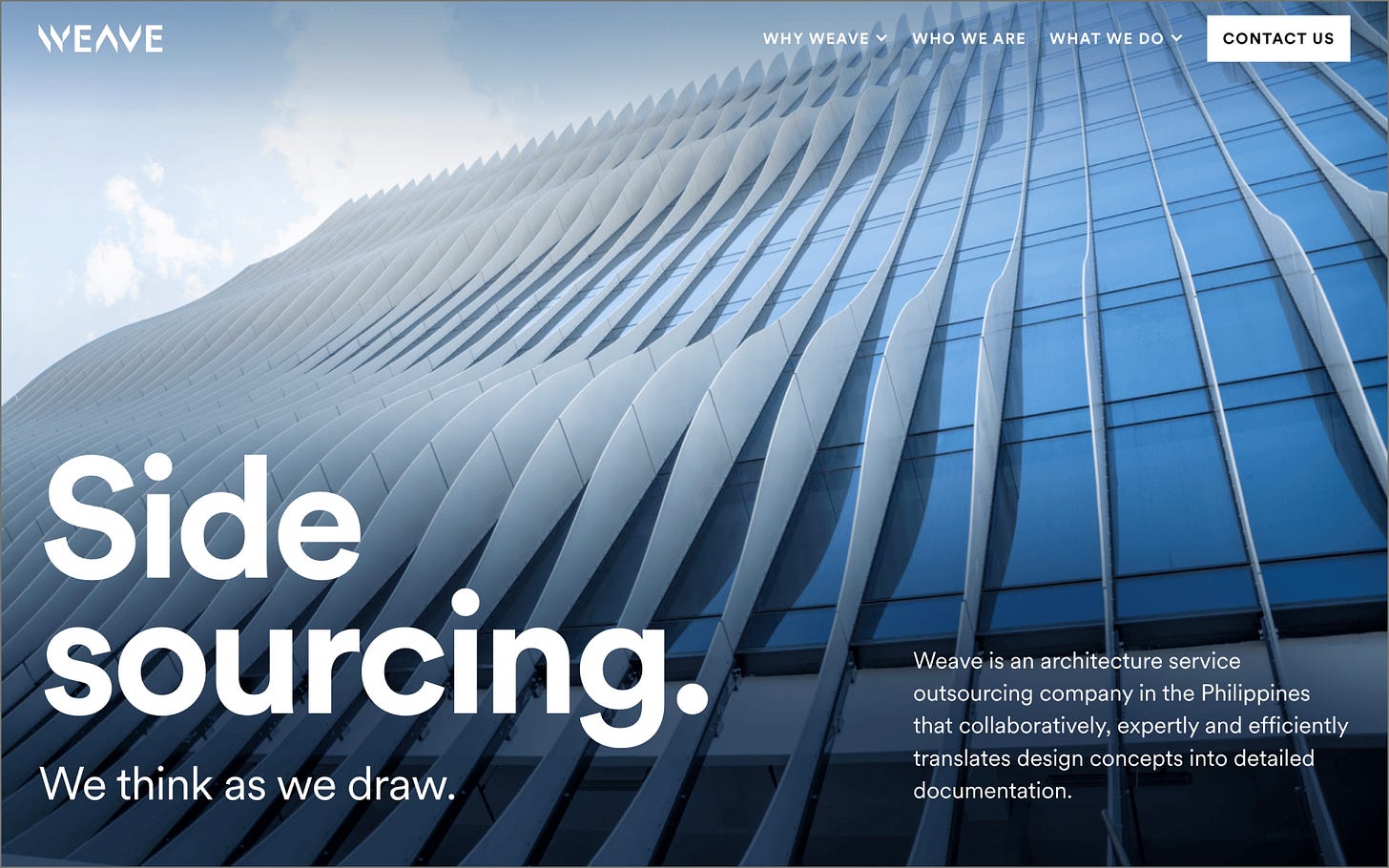
We’re back with a new edition of Web Wizards! Today’s feature details the best ways of mirroring a website’s design to its content. When we think of modern architecture, we might think of grand, sophisticated buildings. The use of large typography and grid layouts in this website, in combination with the stunning imagery, helped to create the perception of strong, grounded buildings. The perfect combo!
Got a cool website you’d like to see featured? Let me know by replying to this email or reaching out.
An Intro
I’m Frances (she/her), an independent designer who specializes in creating bespoke websites and interactive stories.
➤ Frances’ Socials: Instagram, Website, Twitter, LinkedIn
About the Site
Weave is an architecture service outsourcing company that translates design concepts into detailed documentation.
URL: www.weavecp.com
Collaborator(s): I designed and developed the website while Gabriel Reyes created the logo and printed materials.
Tools: Webflow and Figma
Q&A
What did your concept ideation process look like for this project?
I looked at the websites of various architectural firms and observed that many of them utilized grid structures and prominent background imagery in their design. This approach seemed to align with the style of buildings typically constructed by architects, whether intentionally or not. I kept this in mind when designing the website.
My client also wanted the design to evoke strength, so I selected an appropriate typeface and ultimately opted for the heavier weights of Circular, a geometric sans-serif font, to complement the design.
How did you strike a balance between creativity and functionality in this website design or build?
On the functionality side, Weave’s customer base consisted largely of older individuals, so I increased the font size to improve readability. As the website content was technical in nature, I also worked closely with Weave's team of architects to ensure that the language was comprehensible to their diverse clientele, including master planners, interior designers, engineers, contractors, and others.
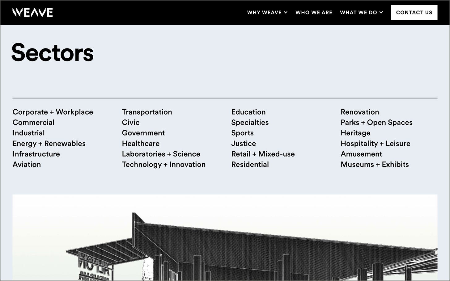
On the creativity side, I adopted various grid layouts to cater to diverse content types. Information-dense texts were arranged in a 4-column grid, while less information-rich texts were placed in a 2 to 3 column grid. This resulted in a clean design. To add visual interest to the formal nature of the website, I incorporated horizontal separators, colored numbers, icons, and custom-made graphics, such as a map, as visual cues.
What challenges did you have whilst designing/building this site?
Due to a limited number of photographs, I enhanced their visual appeal by adding gradients or increasing the saturation of their colors. As the website also contained a significant amount of textual content, I enlarged the accompanying images to offset the perceived "heaviness" of the text.
What are some of your favourite elements/features on the site?
The first section of the website is, without a doubt, one of my favorite elements. The wavy architectural design of the background image is particularly appealing to me, and the fresh colors only add to its allure. I also liked the typeface Circular, as its visual appeal is enough to compensate for the lack of accompanying photographs.
What’s one new thing you learned during the entire process?
Be meticulous with every detail. Even the slightest pixel can significantly impact the overall visual design. No detail should be taken for granted, regardless of how seemingly insignificant it may appear.
If your creative process for this project had a lead single, what song would it have been and why?
"Empire State of Mind" by Jay-Z kept playing in my mind for some reason. This might be attributed to my visceral connection to New York City's stunning architecture.
Thanks for tuning in to this edition of Web Wizards! Definitely reach out if you’d like to be featured or would like to recommend a site to feature.
Till next time ~


