
#008: Make Visible
Sometimes less is more. Using subtle animations and neutral tones to invoke a smooth viewing experience.
We’re back with a new edition of Web Wizards! When I think of how to perfectly encapsulate the essence of a product without doing too much, I think this site will always come to mind. The pastel and neutral colours, the warm-toned imagery, the combination of text and lottie animations, all of these details work together in harmony to create an effective site for a very important issue that lots of us go through.
Got a cool website you’d like to see featured? Let me know by replying to this email or reaching out.

An Intro
I’m Koysor Abdul, a freelance web designer and Webflow Developer based in London, UK (although working remotely and currently living in Italy for 6 months). I’m in my 6th year of freelancing full-time.
➤ Koysor’s Socials: Twitter, Instagram, LinkedIn
About the Site
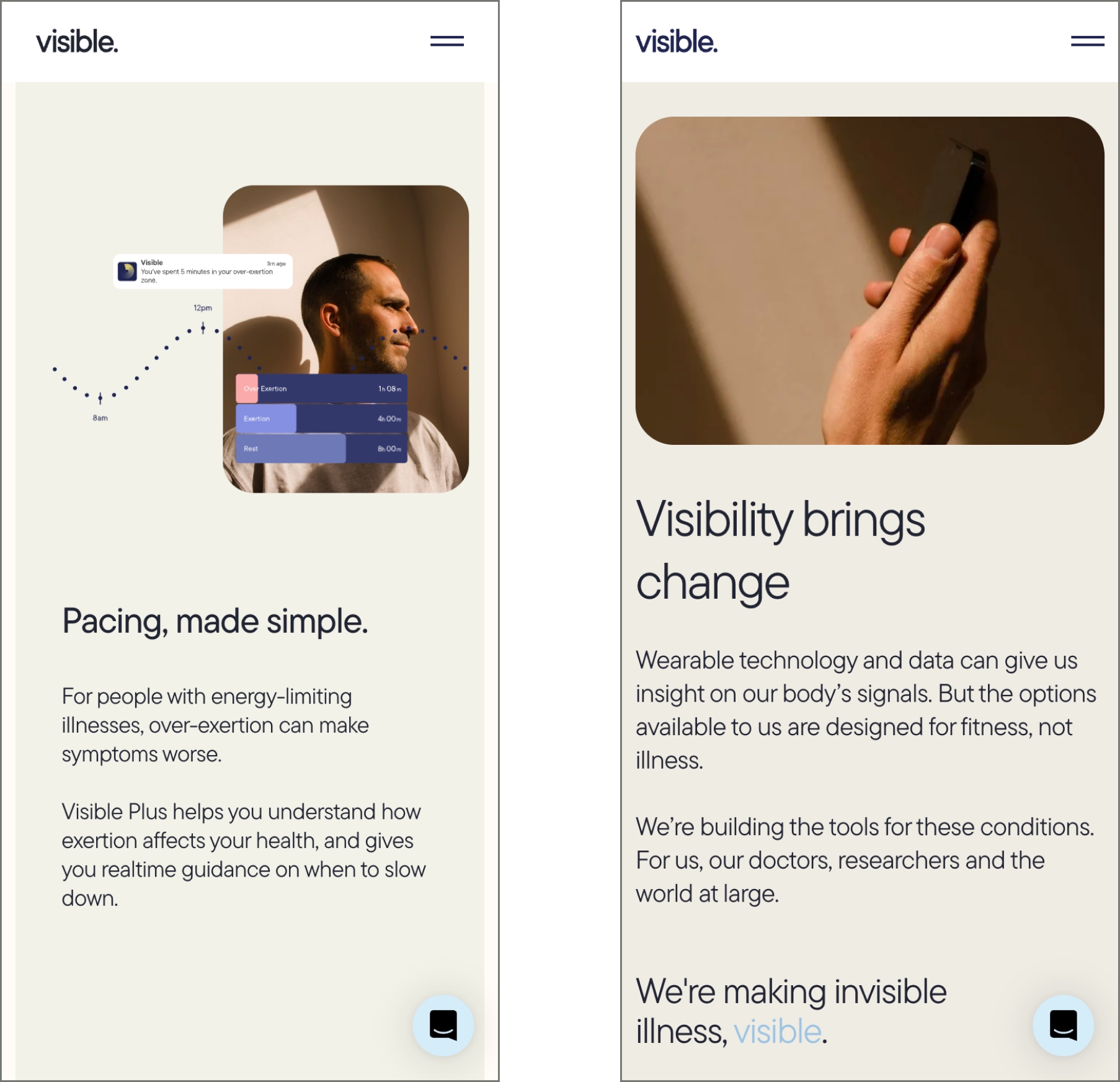
I worked with the team at Visible to design and build their site that helped them launch their product. They primarily have a mobile app that helps you monitor illnesses that are not given enough attention. The initial focus is on illnesses such as Long Covid and ME/CFS.
URL: www.makevisible.com
Collaborator(s): Koysor (Designer/Developer)
Tools: Webflow


Q&A
What did your concept ideation process look like for this project?
Concept/Ideation - I worked with the team to structure wireframes and a flow for the page. They were still working on copy but we had a first draft to start with. They also had branding done by another freelancer prior to kicking off the project with me. So before the project kicked off we had a fairly good idea of what we were aiming for. We had brand guidelines, photography direction, and a few references. We settled on wireframes pretty quickly since the team had given it some thought before the project. Based on those wireframes, I moved onto some initial concepts. Created two concepts with slight differences in art direction. At this stage I’m trying a few things and quickly eliminating any bad ideas to help me narrow down options.
How did you strike a balance between creativity and functionality in this website design or build?
For most of my projects, I’m always trying to hit the sweet spot of keeping it minimal, functional, but definitely interesting enough too. That’s always a challenge as I try my best to avoid adding ‘decoration’ that doesn’t serve much purpose. But on the other end, if we all aimed for functional only, the web would just be full of white background websites with black text and some images. So striking that balance is always the challenge.


What challenges did you have whilst designing/building this site?
The biggest challenge for the project was seeing the new branding being put to use for the first time and the team being unsure about it. The colour palette was made up of these two-tone gradients that were suggested for the background. After I laid out my two concepts, we decided to pull back on the use of gradient backgrounds. This led to the brand designer adjusting a few things and me then having to come up with another concept that worked for our new direction.
What are some of your favourite elements/features on the site?
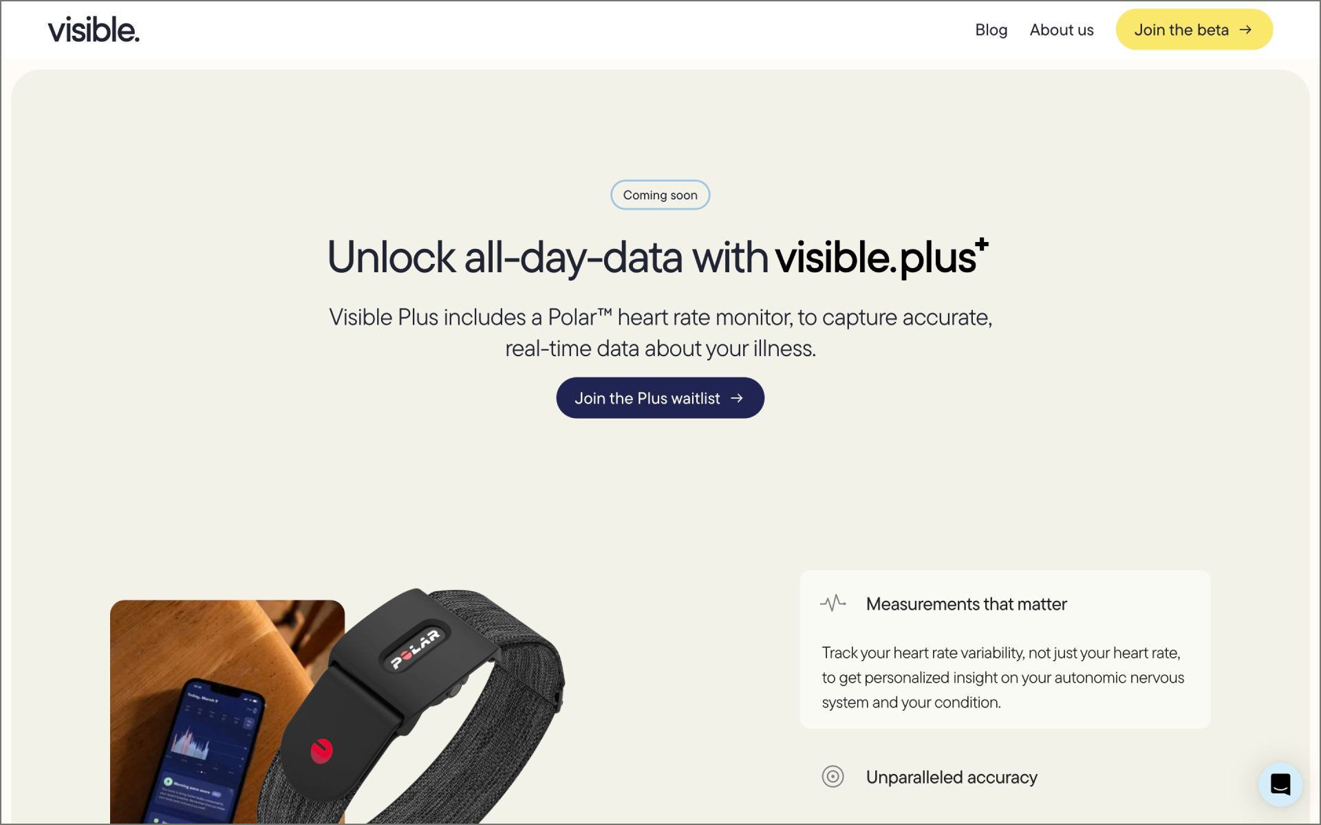
My favourite section is the ‘Unlock all-day-data with the visible.plus’. This section is exactly the sweet spot I always try to aim for. It’s a split section with copy and visuals/lottie animations. It’s minimal but still feels alive and interesting.
What’s one new thing you learned during the entire process?
I wouldn’t say it’s a new thing, but it certainly re-inforced my belief in refining ideas until they feel just right. After we settled on our concept, from that point the designs didn’t change much but every small adjustment and refinement made the difference in the end when added up all together.
If your creative process for this project had a lead single, what song would it have been and why?
This is definitely the hardest question! It would have to be something calm and relaxing. Our direction in the end was all about warmth and empathy. Illnesses can be a sensitive subject, and that was at the forefront of our thoughts on the project. So throughout my process I was always trying to align my creative direction to that aim. In terms of a single, I would probably pick something from one of my favourite artists, James Blake. It would have to be The Wilhelm Scream or Retrograde.

Thanks for tuning in to this edition of Web Wizards! Definitely reach out if you’d like to be featured or would like to recommend a site to feature.
Till next time ~