


#002: Axon Body 4
Pushing the boundaries of what it means to showcase a product using dynamic 3D animations.
We’re back with a new edition of Web Wizards! In this edition, we’re featuring a site that incorporates scroll animations and 3D visuals to create a unique way of showcasing a product. It’s the perfect example of ‘show, don’t tell’, so keep reading to find out more!
Got a cool website you’d like to see featured? Let me know by replying to this email or reaching out.

An Intro
I'm Diego, a brand designer and Webflow developer living in Paulínia, Brazil. I've been doing websites for around 12 years - mostly WordPress stuff - but only recently decided to restart my career and move entirely to Webflow. Now I help businesses around the world create engaging experiences using good design, motion, and Webflow.
➤ Diego’s Socials: Twitter, Dribbble, LinkedIn
➤ Jesse’s Socials: Website
About the Site
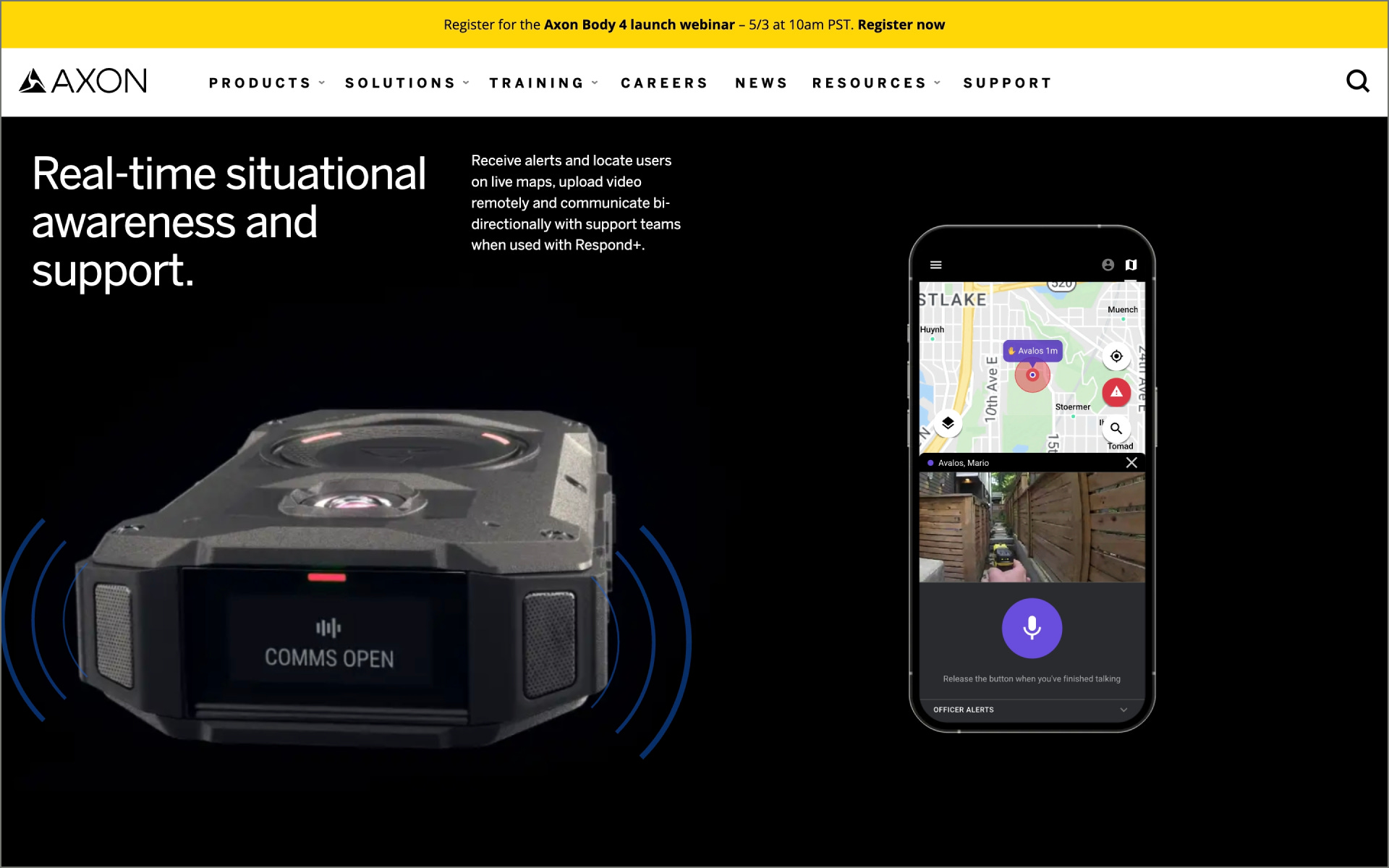
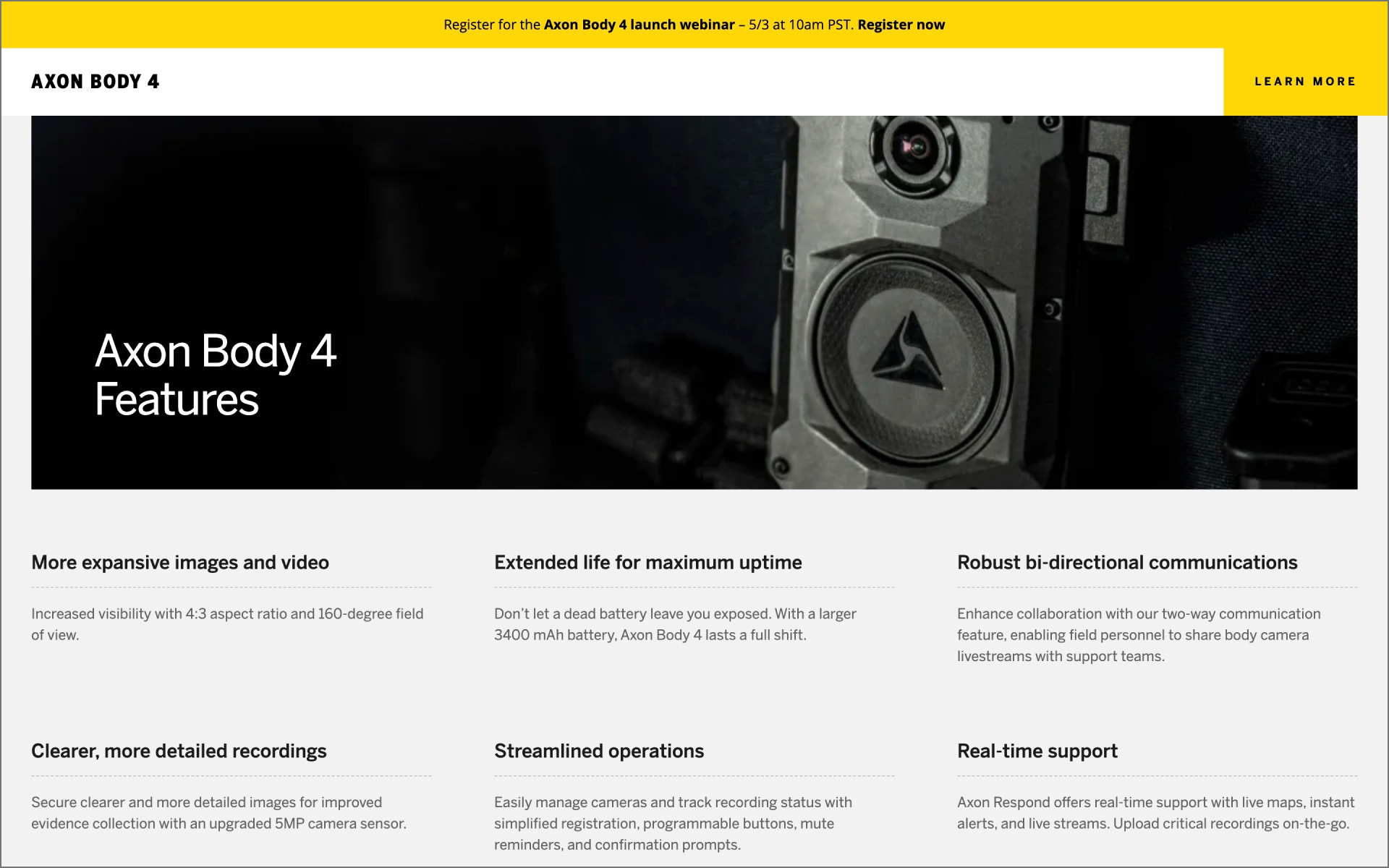
Axon Body 4 is the latest body camera version launched by Axon. With lots of enhancements and advantages compared to the previous version, the Axon team wanted to create an engaging and impactful landing page to showcase all the improvements.
Collaborator(s): This website was a team effort. I collaborated with the Axon team - who provided the content (photos, copy, etc). Diego Toda de Oliveira (Design/Development); Jesse Stormer (3D Renders)
Tools: Webflow, JavaScript (for some custom code, including GSAP), and Lottie (for some icon animations)


Q&A
What did your concept ideation process look like for this project?
I always like to work in "fidelity levels" or layers. The first step is always figuring out what is the core message you want to pass on. That will help you understand what are the sections that you need, what is the right order, how each one connects to the next, etc.
After that, I always add "layers" of fidelity on top of the wireframes. Starting with figuring out the layout of the elements - text, headlines, assets in general, etc. Always keeping in mind things like balance, white space, and sequence. Then I start doing more passes on the design, adding more details, like grid alignment, sizing, spacing, fonts, colors, etc. I do that until I get into the high-fidelity version of the design, ready to be implemented into Webflow.
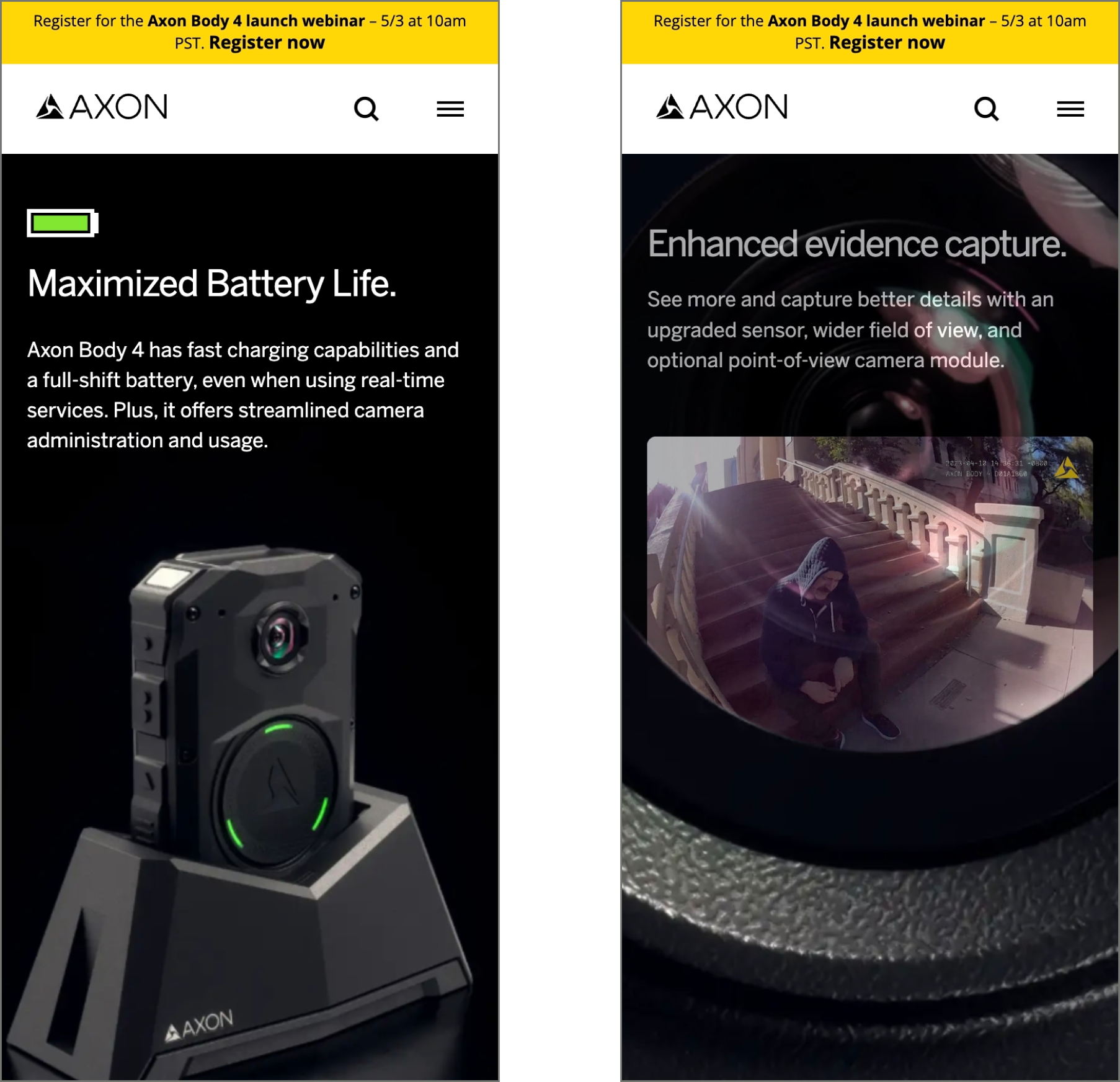
For the animation part, I don't like to spend time building prototypes on Figma. If it's a scroll-based animation, that doesn't even make sense. So I always take a storyboard-like approach, where I envision the whole sequence as a "movie", that has some core keyframes that define everything. The rest is mostly transitions between those frames. So I draft these key frames as a sequence of frames in Figma, in a good enough fidelity to demonstrate to the client the idea. This approach was especially useful for this project, since the core animation is the 3D camera moving around. So I just created some key frames for the camera animation, and the 3D designer was able to pick up and develop the rest of the animation sequence.
How did you strike a balance between creativity and functionality in this website design or build?
First, you need to keep the goal in mind. On this one, we wanted to demonstrate all the improvements of the current model compared to what's available in the market. so all the sections, and animations were planned to put that front and center of the whole experience. Second, you need to keep in mind that every animation must have a purpose. Animating everything just because you can is a mistake. You need to have a goal with every planned animation and interaction - it can be to demonstrate a feature, to call out focus to a specific area of the screen, to translate a message emotionally. This is what creates animations and interactions that makes sense.
What challenges did you have whilst designing/building this site?
The biggest challenge for sure was to create the 3D animation, and run it on scroll, while keeping all the sections in sync with it. AND, at the same time, keeping the file sizes reasonable. The animation is an image sequence played with GSAP + ScrollTrigger, and every section triggers a specific frame range on the image sequence. And there are about 356 images! That's a lot to load. Compressing everything on a good enough level was not easy.
What are some of your favourite elements/features on the site?
I definitely love the 3D animation part, especially in two places. The first one is when you zoom into the camera and you start seeing "what's inside". The second one is when you go to the battery section, and the battery icon grows in sync with the body camera connecting to the dock. I'm really happy with the results on those two sections.

What’s one new thing you learned during the entire process?
On the creative side there was nothin new, but technically I learned that keeping image sequences in sync with sections and multiple ScrollTrigger instances is quite a challenge. It took me a lot of trial and error until I got the timings and settings right to make everything sync up together.
If this website was a lead single, what song would it be and why?
I think the vibe of the whole experience kind of goes well with "Session", an instrumental song from Linkin Park (Meteora album). Definitely scrolling through the landing page while listening to that song makes the experience more fun!

Thanks for tuning in to this edition of Web Wizards! Definitely reach out if you’d like to be featured or would like to recommend a site to feature.
Till next time ~